Here at Surface, we see examples of every design idea out there—from the innovative to the awful. As we prepare for the year to come to a close, here are a few trends that we hope will be left behind in 2016.
An End-of-Year Roundup
Looking back on the design trends that need to end before 2017.
BY SURFACE December 08, 2016
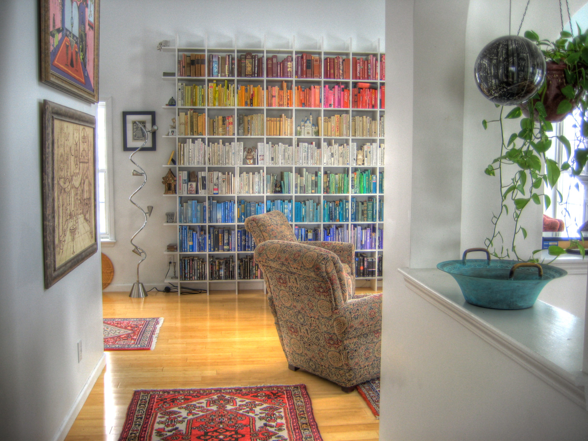
Books Arranged By Color
On a list of the world’s most vapid pursuits, organizing books by color ranks a few notches above watching Rich Kids of Beverly Hills and writing year-end lists. What does it signal to your Tinder date that those muted pink hardcovers you stacked against a white wall in your living room do not represent a season’s worth of reading, but a visit to Books By The Foot? Who is this monster I’ve just slept with? your one-night-stands think as they silently sneak out before dawn. For the uninitiated (i.e., people who read) color-coding one’s shelves has become a design trend so prevalent, that there are services like BBTF, charging “$6.99 per linear foot,” filling a hole in an unexpected market: helping people pretend to be literate. How telling that we’ve devolved so much as a society that a book’s value can now be purely external. There’s a whole world to discover inside the pages that make up the fauvist nightmare you’ve created. So to avoid judgment, stop arranging books by their covers. —Charles Curkin

Disemvowelment
Vowels have become endangered. Thanks to a popular design trope among start-up companies, they just aren’t used much anymore. Names have been disemvoweled. If that sounds gross, that’s because it is. Of the multitudes of offenders, Tumblr and Grindr immediately come to mind, but it didn’t start with them. Think back to the mid-aughts, when Motorola had a foothold in America’s mobile phone market with its ubiquitous, vowel-gutted flip-phone, the Razr. Pronounced like the sharpened tool used to remove body hair, it was the missing “o”, not the phone’s design—sleek, thin, and chrome—which rendered it cool. It was followed by the introduction of its clunkier cousin, the Krzr, which was didn’t have the same impact. I’ll admit the disappearing vowel was a cool experiment for 2004, a time seemingly devoid of irony, when people wore Juicy Couture sweat suits and listened to Lil Jon. But that’s where it should have stayed. Though now, with increased demand for memorable URLs and names, it’s become a trend—one so prevalent that disemvowelment has become the status quo. Tinder may have failed me in the relationship department, but at least its use of vowels is refreshing. —Lily Wan
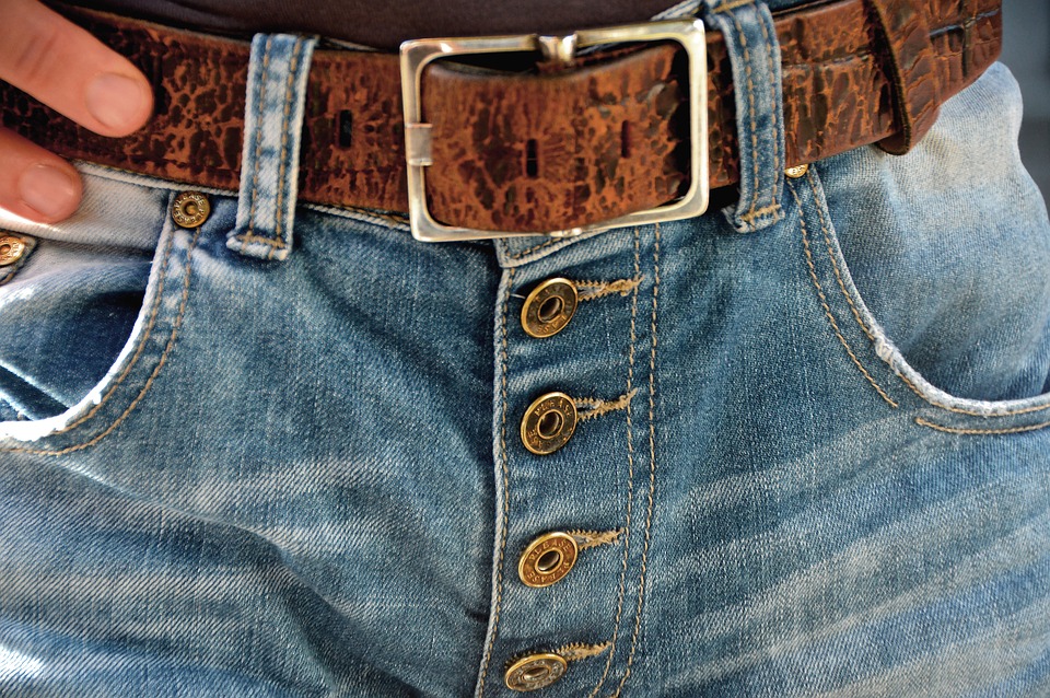
Button Flies
I enjoy many things that today are classified as old-fashioned, like reading magazines in print and making phone calls rather than texting. But for some reason, I just never seem to warm to the idea of button fly pants, which Vogue reported in 2015 had come back into style. Kudos to the companies like Levi’s for keeping them relevant for almost 150 years, but the zipper is 20 years younger and far superior. Our backpacks, suitcases, and boots aren’t fastened with buttons, and the existence of these items, like pants, is rooted in a sense of urgency. They shouldn’t slow you down. We already submit to putting pants on one leg at a time; the process shouldn’t be protracted. Although I appreciate Jerry Seinfeld’s sentiments about not needing “sharp interlocking metal teeth” below my belt, I prefer not to worry about unbuttoning after a long queue for the ladies’ room, or having the hem of a shirt push through the gaps between buttons. The invention of the zipper was revolutionary, an ergonomic marvel—rejecting it is an exercise in futility. —Angelica Bongioanni

Millennial Pink
I’m not sure whether I first saw it on a tube of Glossier lip balm or a can of La Croix sparkling water, but sometime over the past year, the pink became inescapable. Officially called “Pale Dogwood” by Pantone, it’s a shade halfway between beige and orange that’s become sufficiently omnipresent to have its own moniker: “Millennial Pink.” In commercial design, it has become a shorthand for sophisticated urban femininity: It’s dull enough to not be saccharine or cloying, but it’s not so masculine as to be—well, anything other than pink. When paired with a brand’s logo in a block sans serif font, we are meant to understand the pink as a stand-in for the cool girls of Echo Park or Greenpoint. But the pink has always irked me. There’s something infantilizing about it: After all, it’s the same hue as a baby bow. In deeper versions, it’s the color of a pimple. The so-called “Millennial Pink” doesn’t remind me of the confident woman I want to be, but of the awkward teenager I once was. I’m picking a different lip balm.—Moira Donegan