Long gone are the days of Reefer Madness and anti-marijuana McCarthyism. Since 2012, when Colorado and Washington became the first two states to pass laws taxing and regulating marijuana, its image in American culture has changed drastically. Over the past few years, cannabis retail stores in these states have become a common sight; last year, both Alaska and Oregon legalized weed. [Editor’s note: In November 2016, California, Massachusetts, Nevada, and Maine joined them.] Medical marijuana is legal in 28 states and the District of Columbia. Public approval of the drug, not surprisingly, continues to grow. According to a 2015 Pew Research Center report, 53 percent of the population favors pot legalization, and within the millennial generation that number is far higher (68 percent). In California, medical marijuana sales hit $2.7 billion last year, according to cannabis research company ArcView and New Frontier, which also called legal pot “the fastest-growing industry in America,” with 74 percent growth between 2013 and 2014.
Even though it’s prohibited to transport across state lines, marijuana is quickly turning corporate. The branding, packaging, and design of it, however, typically remains kitsch, cliché, and decidedly amateur. This too, though, appears to be changing, albeit slowly. Rapper Snoop Dogg’s Leafs by Snoop brand recently unveiled packaging conceived by New York firm Pentagram; Tommy Chong, of Cheech and Chong fame, is planning to mass-produce his professional-looking Chong’s Choice label; and private equity firm Privateer Holdings inked a 30-year licensing deal to create the contemporary-feeling Marley Natural. Designer smoking-accessories companies like Tetra and L.A.’s Mister Green Life Store have also entered the mix.
In light of the current bud rush, Surface asked 12 leading design studios to rethink marijuana branding and packaging. (Two other firms we reached out to weren’t able to participate, they said, because of already underway collaborations with soon-to-launch pot companies.) The brief we sent over was simple: to create a fictionalized aspirational marijuana brand—essentially, the future Starbucks of weed. In turn, they supplied us with the name and concept of the brand, a logo, and basic packaging.
Here, we present the results, which include three companies called Hi (a total coincidence), a weed-laced tea, and a marijuana-infused water concept targeting working moms. Consider this our effort to spur further conversation about the branding of marijuana, and where design fits into it. As Jonathan Ford, one of the participants and a founding partner and the chief creative officer of the firm Pearlfisher, puts it, “While it’s fun to imagine what these products could be like in a world with minimal restrictions, one wonders whether this style of pared-back design will be possible for a product that will likely need safety labeling akin to cigarette packaging—a challenge for our culture as it seeks to integrate this product in a modern context.” Perhaps the reefer business remains a bit mad after all.
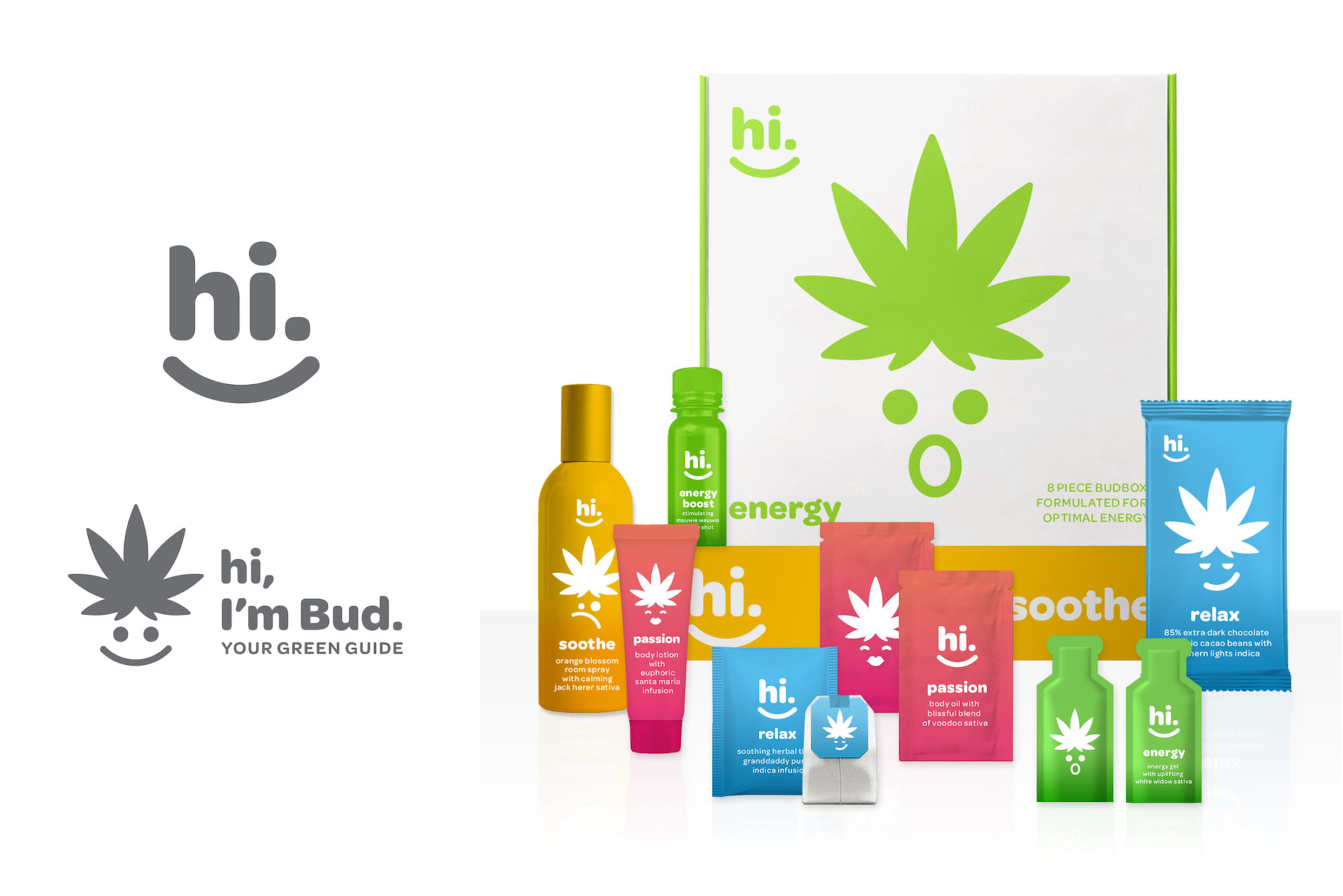
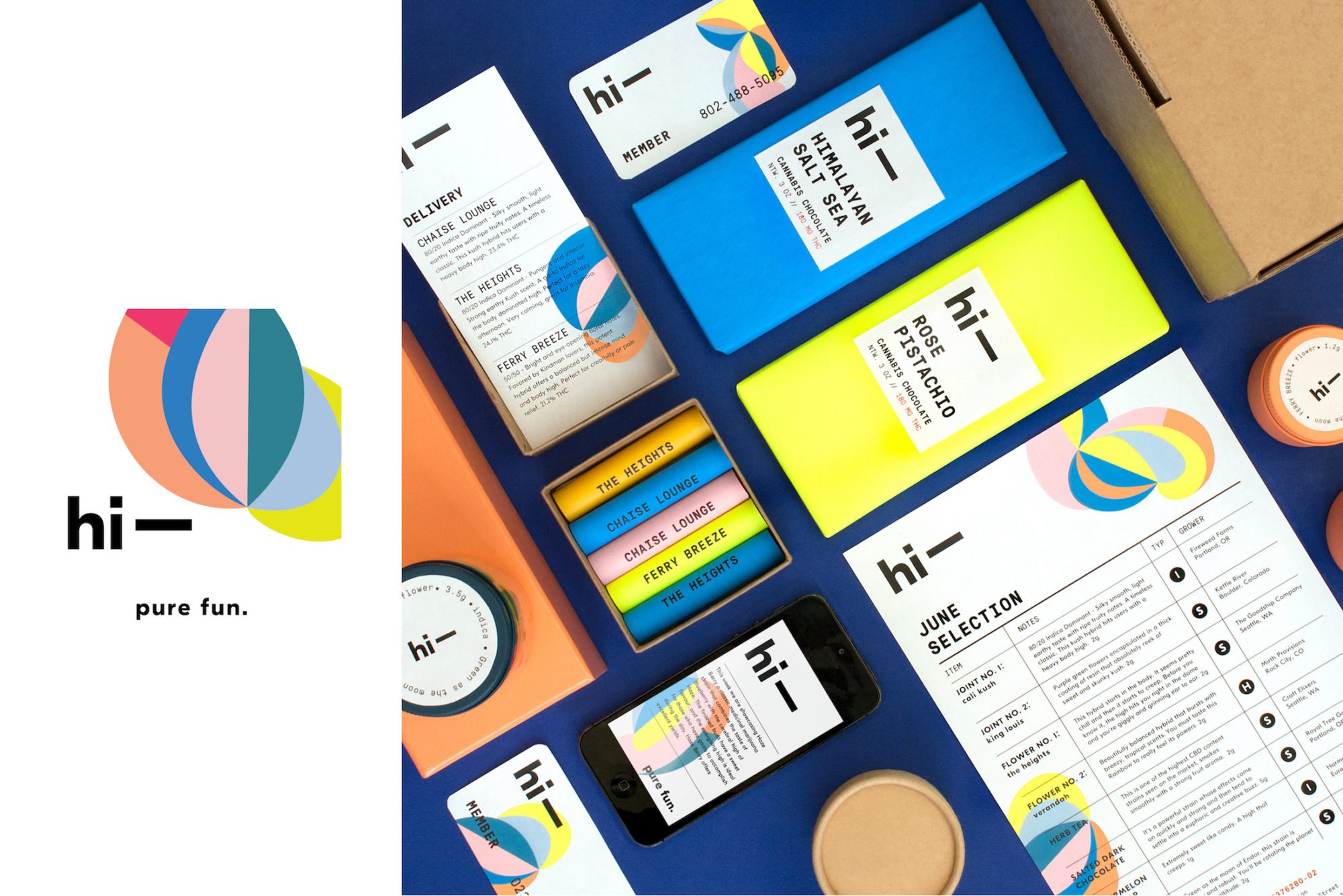
Hi by Bruce Mau Design, Los Angeles
“Hi is a monthly subscription service that aims to democratize the experience of living with cannabis in a way that demystifies the product. Customers order ‘BudBoxes’ online, indicating what kind of usage they desire—they can choose from select product lines such as Soothe, Relax, Passion, Energy, and Focus. Custom-tailored boxes are then delivered to their doorstep, each containing single servings of cannabis products, pre-measured to optimal dosages. With its casual and welcoming name, the brand stands out among an overwhelming amount of existing medicinal and esoteric brands. Hi conjures up a bright and fun state of mind, designed to put consumers at ease in what otherwise may be an overwhelming decision. The vibrant colors and bold, friendly typography evoke both simplicity and general cheeriness, while the character Bud serves as a friendly guide to choosing products in an enjoyable way.”
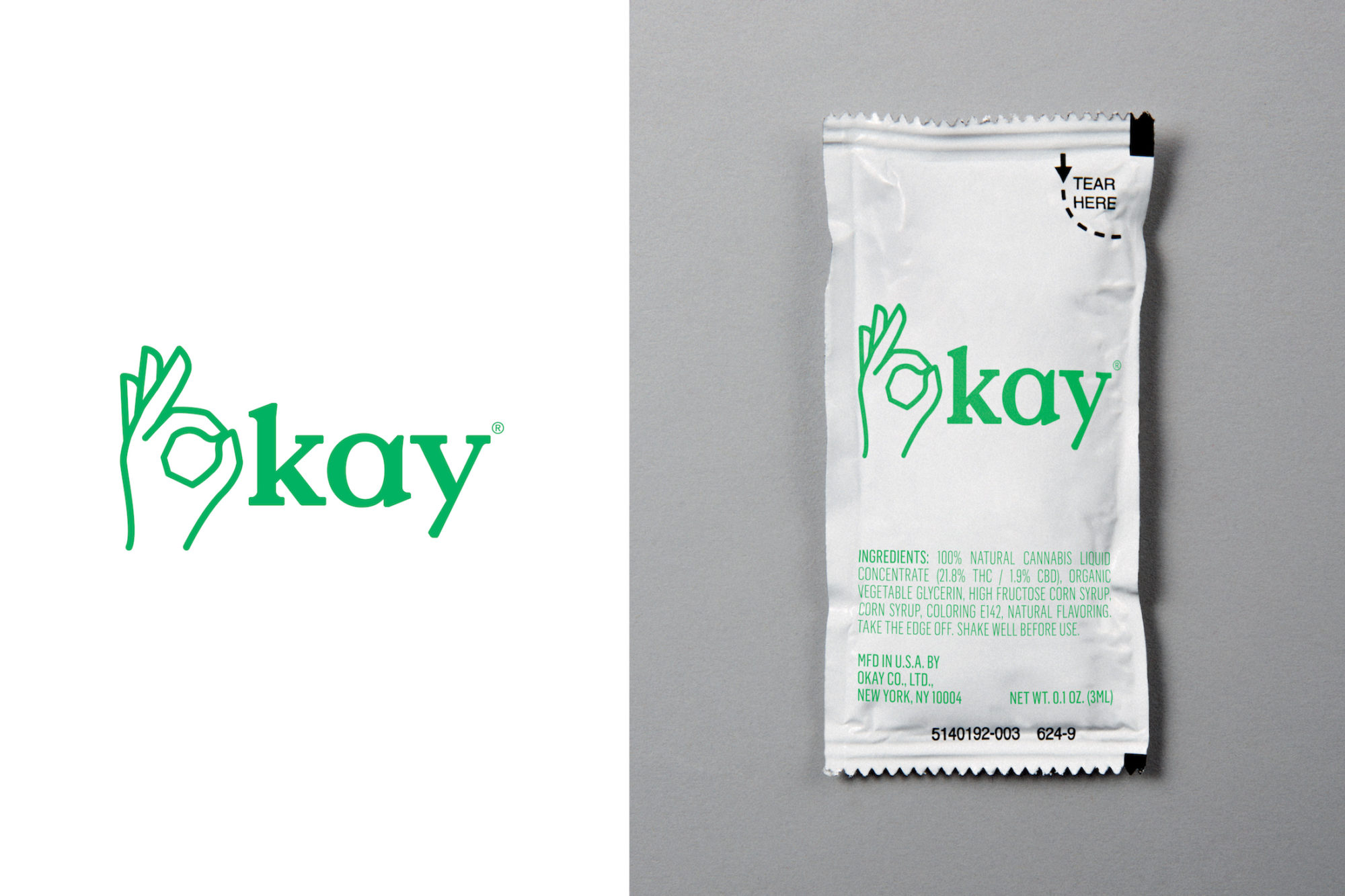
Okay by Base Design, New York
“Because legal marijuana is a relatively new category, existing products rely heavily on conventional symbols. We wanted to instead imagine how marijuana might exist 10, 20, 30 years from now, as a part of everyday life. We envision Okay as a mood modifier, a socially accepted additive as common as coffee or chamomile tea—in essence, a less sinister version of Soma from Aldous Huxley’s Brave New World. Consider it a generic ‘masstige’ product that has become the Kleenex of its category, one that feels as ubiquitous in our culture as Sweet ’n Low or Budweiser.”
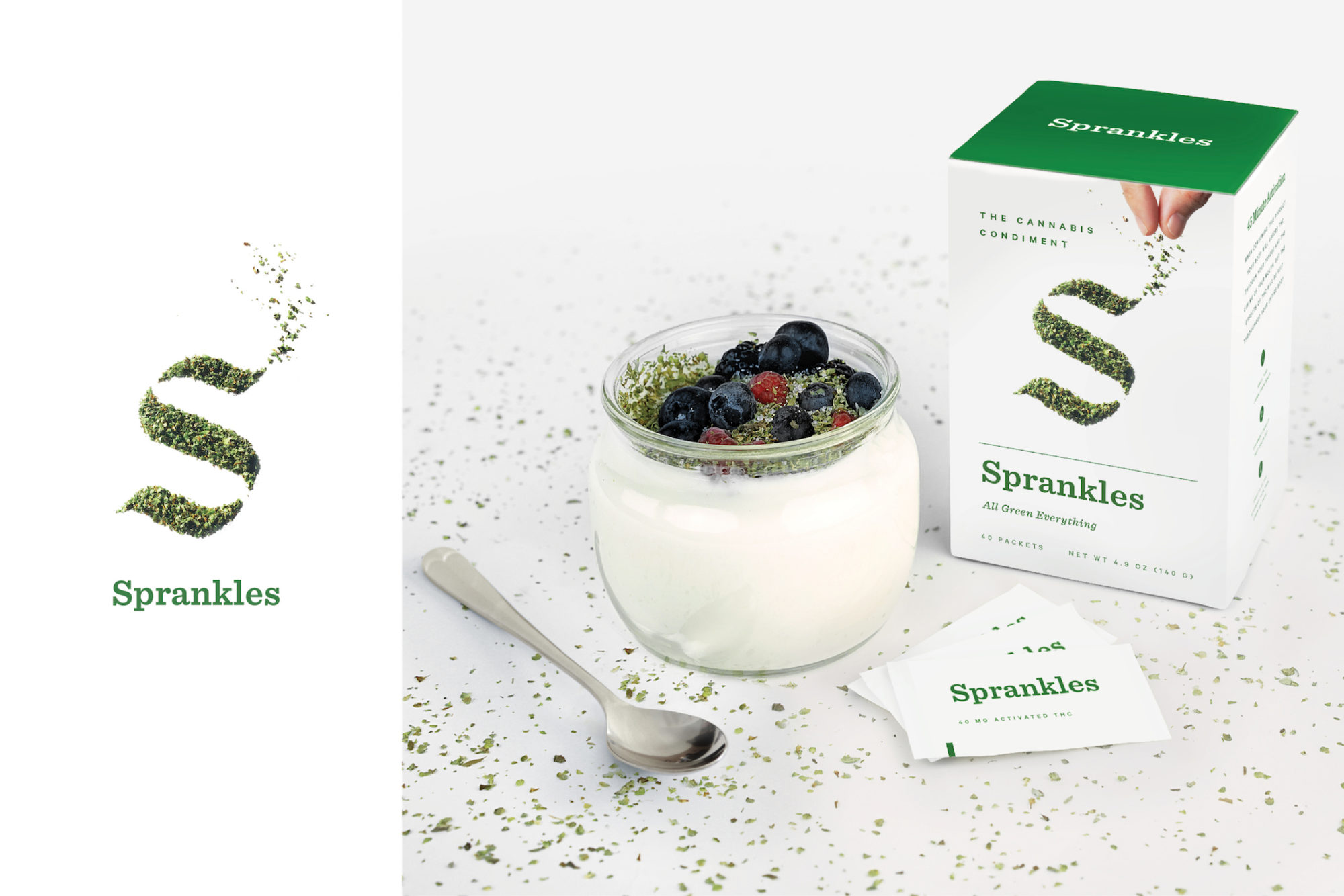
Sprankles by Franklyn, Brooklyn
“Sprankles is the original cannabis condiment. A premium blend of flower crumbles and kief, decarboxylated to optimize the medicinal or psychoactive effect, it turns anything into an herbal edible. Sprankles is a conflation of the words ‘sprinkles’ and ‘dank’—the latter a slang term for high quality marijuana. It also sounds a bit hip-hop, which we like. Packaged in single-serve packets, it’s convenient and discrete. The visual identity is clean, modern, a bit irreverent, and primarily focused on showcasing the herbal shake.”
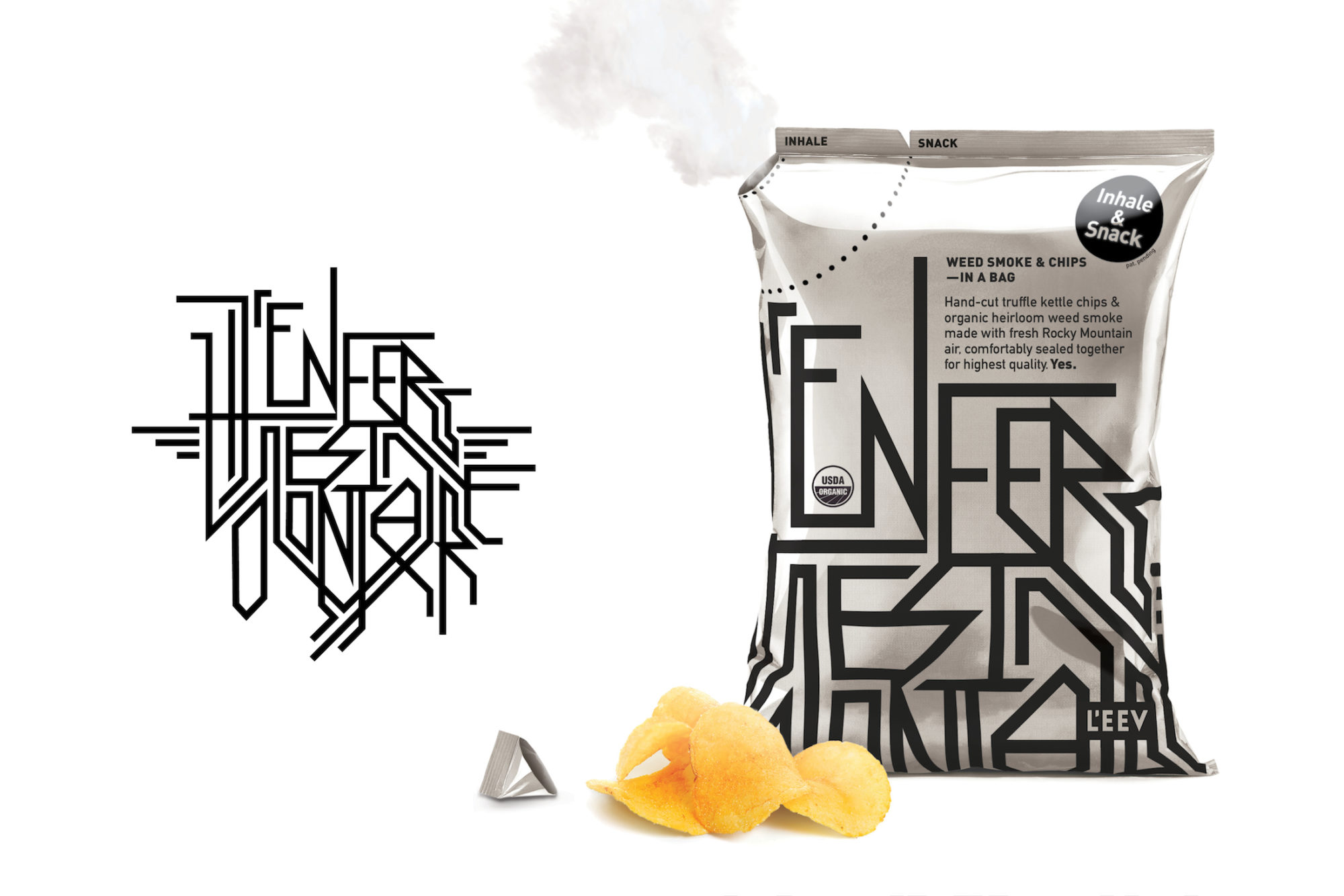
L’Enfer Est Volontaire by Karlssonwinlker, New York
“Our brand’s name is French. And it rhymes. It’s quite long, unwieldy, and nicely pretentious. It means that hell is only optional, that one has a choice to live in it or not. The accessible premium products of L’Enfer Est Volontaire (or L’EEV) give you that choice. The first one is a bag of artisanal chips filled with organic weed smoke from the Rocky Mountain, conveniently sealed together for highest quality and freshness. Adding marijuana smoke doesn’t use any additional energy or resources in its supply chain than an ordinary bag of chips.”
Hi by MGMT, Brooklyn
“Our brand is a personal chronic concierge, providing both on-demand delivery service via mobile and web and a monthly curated selection of high-end organic varietals. Products vary each month and include artisanal take on classic munchies: Himalayan sea-salt chocolate bars, organic gummy bears, and hybrid kale chips—all providing a guaranteed ‘Hi.’ The aesthetic could be described as a post-modernist lava lamp; the mutable logo acts as a free-spirited doodle. Inspiration was drawn from Karel Martens and Gabriel Orozco. Unfortunately, no products were tested during the creation of this image.”
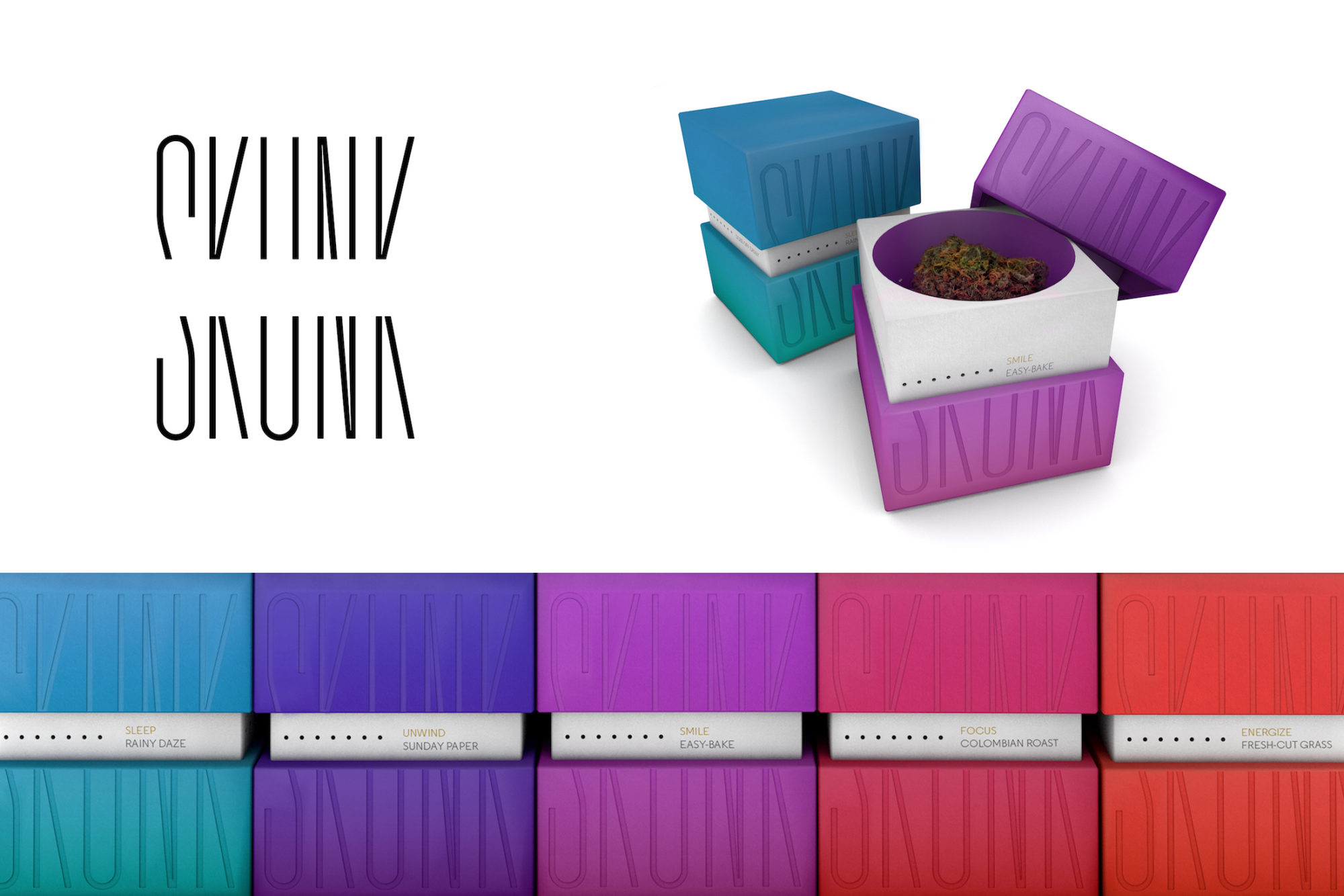
Skunk by Original Champions of Design, New York
“Skunk’s aerated packaging delights your sense of smell on first contact. Across a miscellany of products, scent and sensation work together to affect your mood. Cool undertones of sandalwood relax; zesty wafts of lemongrass energize. The brand and its packaging design reflect the way you’ll feel when using Skunk. In marijuana culture, ‘skunk’ refers to strong-smelling cannabis strains. We liked that, so we adopted it. We encourage users to let their noses guide them. Product names like Sunday Paper, Easy-Bake, and Colombian Roast are equally deliberate, evoking pungent aromas associated with mood-changing moments.”
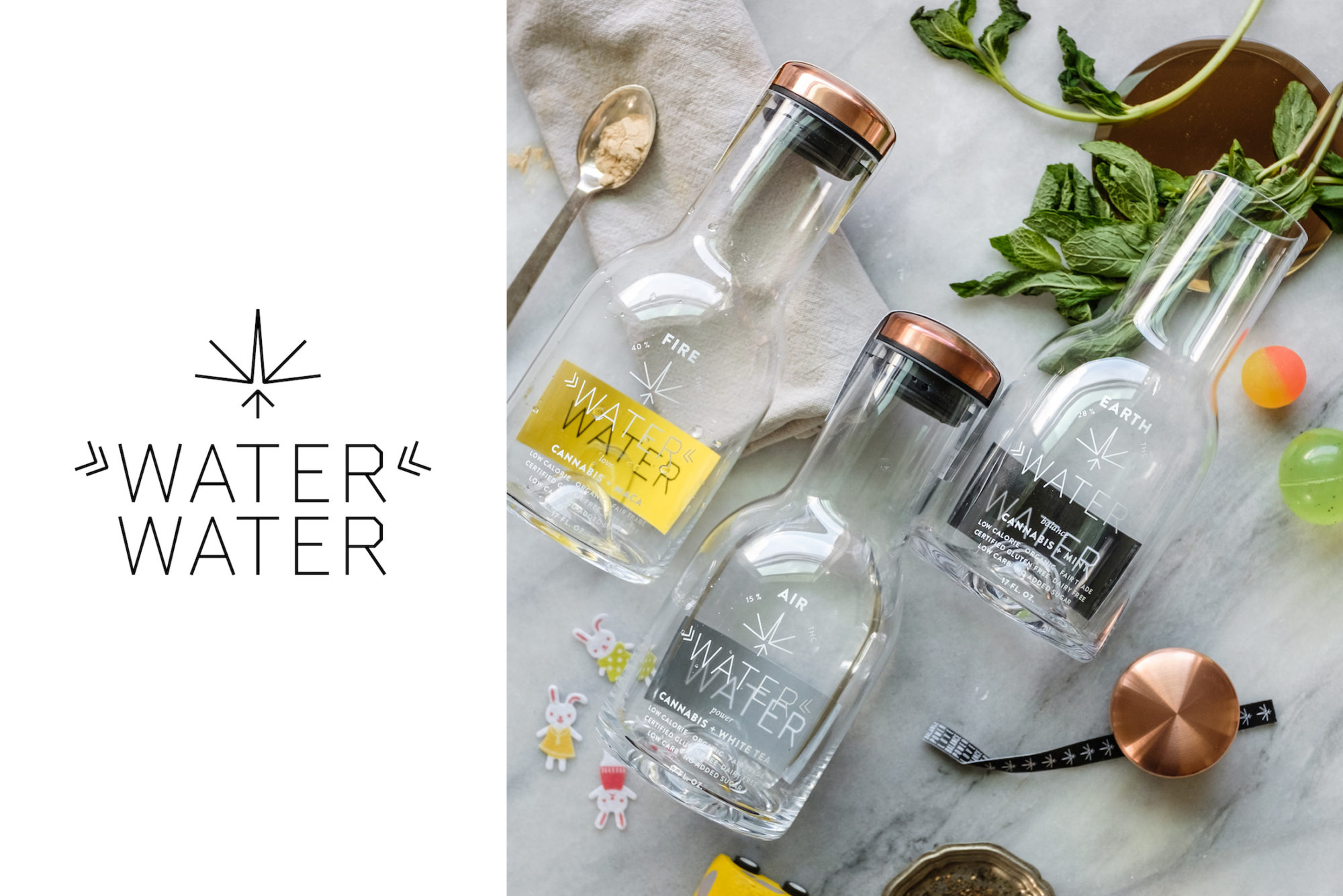
Water Water by Omnivore, Brooklyn, Portland, and Los Angeles
“Water Water is marijuana-infused, organic, and has fewer calories than alcohol. Flavors in three different THC levels pair with supplements to accent the three pillars of the working mother’s life: work (“Air”—power), children (“Earth”—balance), and partner/relationship (“Fire”—love). Water Water was born out of our own chaotic lives as working mothers. We wanted to poke fun at our impossible dream to “do it all” without sacrificing anything.”
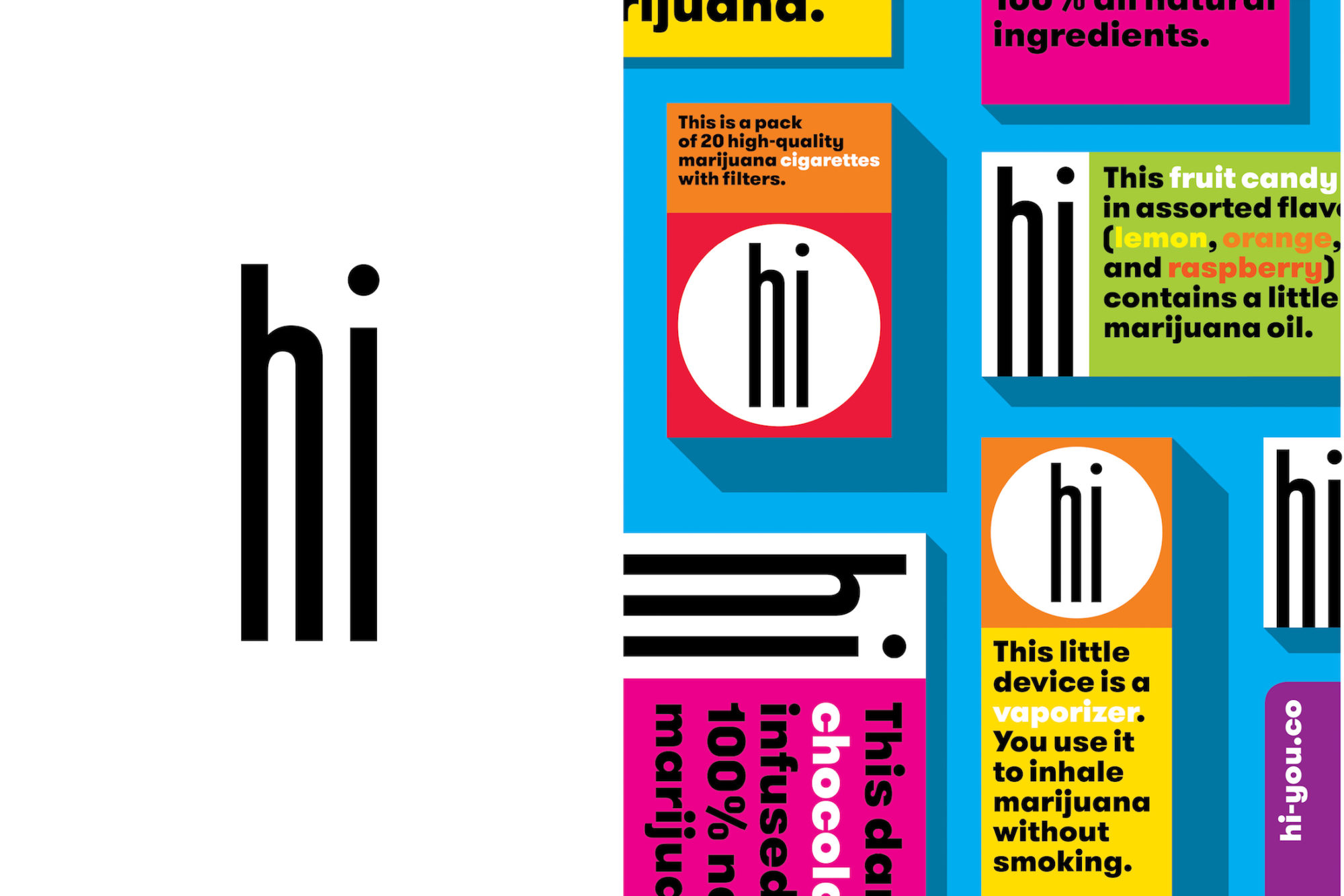
Hi by Open, New York
“Hi is a gateway brand. We always encourage companies to talk directly to their customers and make them feel comfortable and welcome. The friendliest way to do that? Say Hi. Hi sells cigarettes, snacks, and vaporizers to people who want to enjoy some weed, but don’t need to make a big thing about it. The few existing and forthcoming commercial marijuana brands all trade on preexisting aesthetics and clichés. Other categories of products have gotten past that by now. We didn’t want to wait. But while we wanted to make Hi clean and colorful and bright, one of our designers reminded us to watch it: Marijuana is not for kids. So though Hi may use bright colors, it’s aimed at grown-ups.”
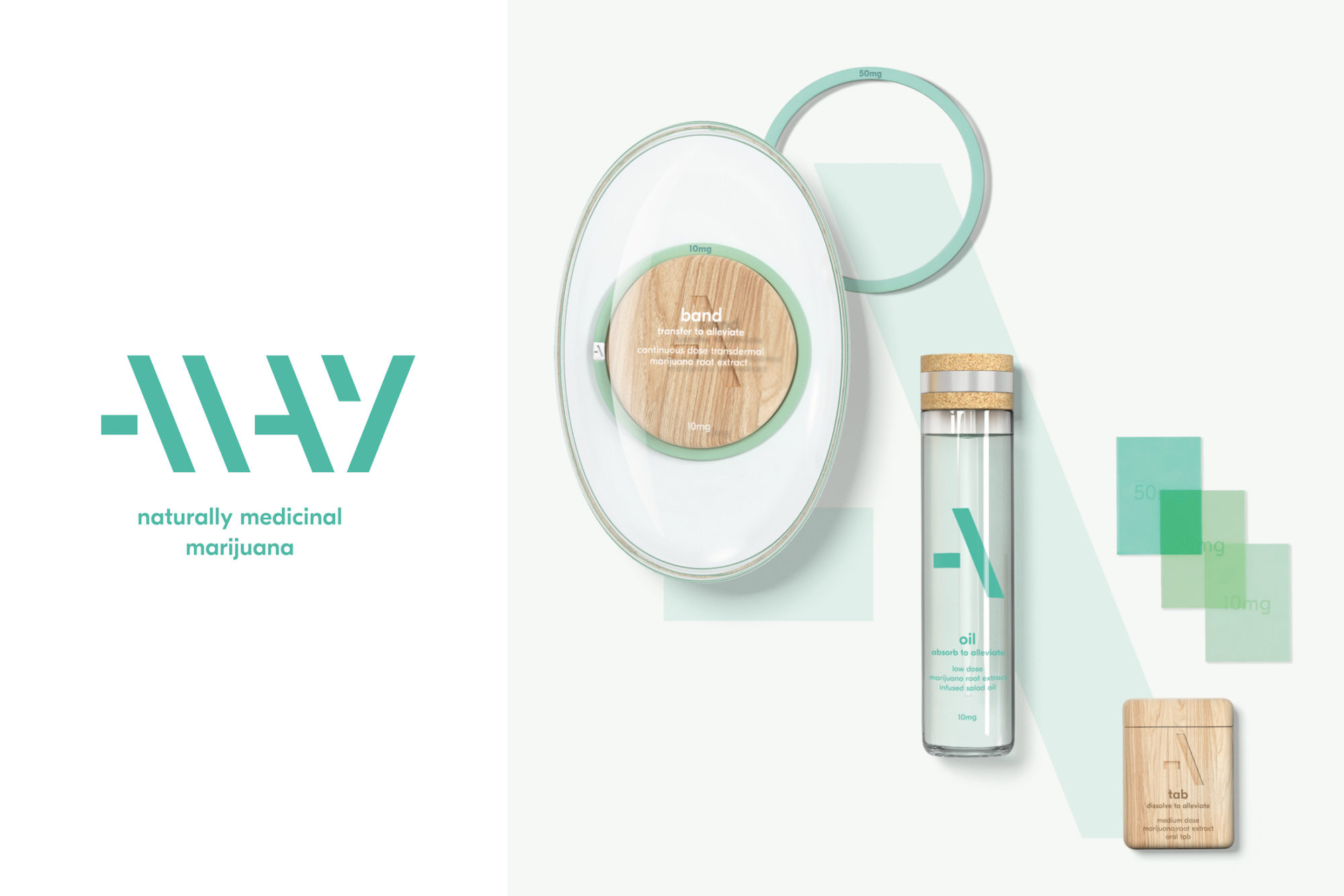
Allay by Pearlfisher, New York and London
“Allay is a product range that uses the naturally alleviative properties of the marijuana root to relieve persistent symptoms of stress, sickness, and pain. Taking a number of on-the-go lifestyle forms, including a wristband, an edible oil, and dissolvable oral tabs, the selection is designed to soothe and sedate by intuitively administering controlled and customized medical dosages of marijuana. The aesthetic is simple, calming, and pure, challenging the traditional and functional language of the pharmaceutical category.”
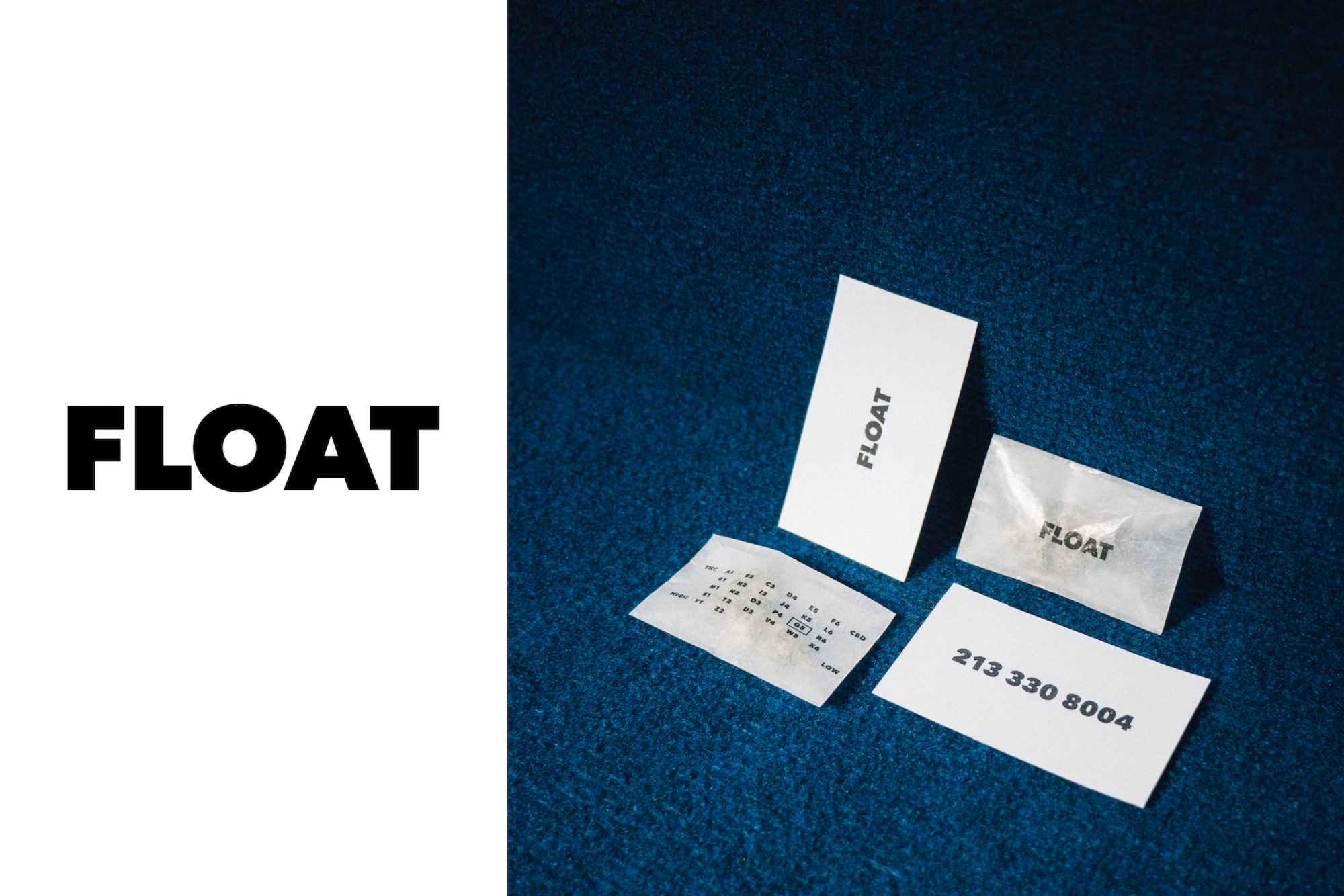
Float by Public Library, Los Angeles and Portland
“In coming up with the brand’s name, we wanted a word that sounded and looked like the emotion we wanted to convey. The meaning, sound, and letterforms were all elements we wanted to work together to reinforce the concept, an abstracted and visual onomatopoeia. In the design, there’s a lot of play with textures, opacity, muted colors. It’s the grown-up version of a nostalgic high-school experience: the various plastic bags, envelopes, and paper footballs that were vehicles of the bathroom-stall trade.”
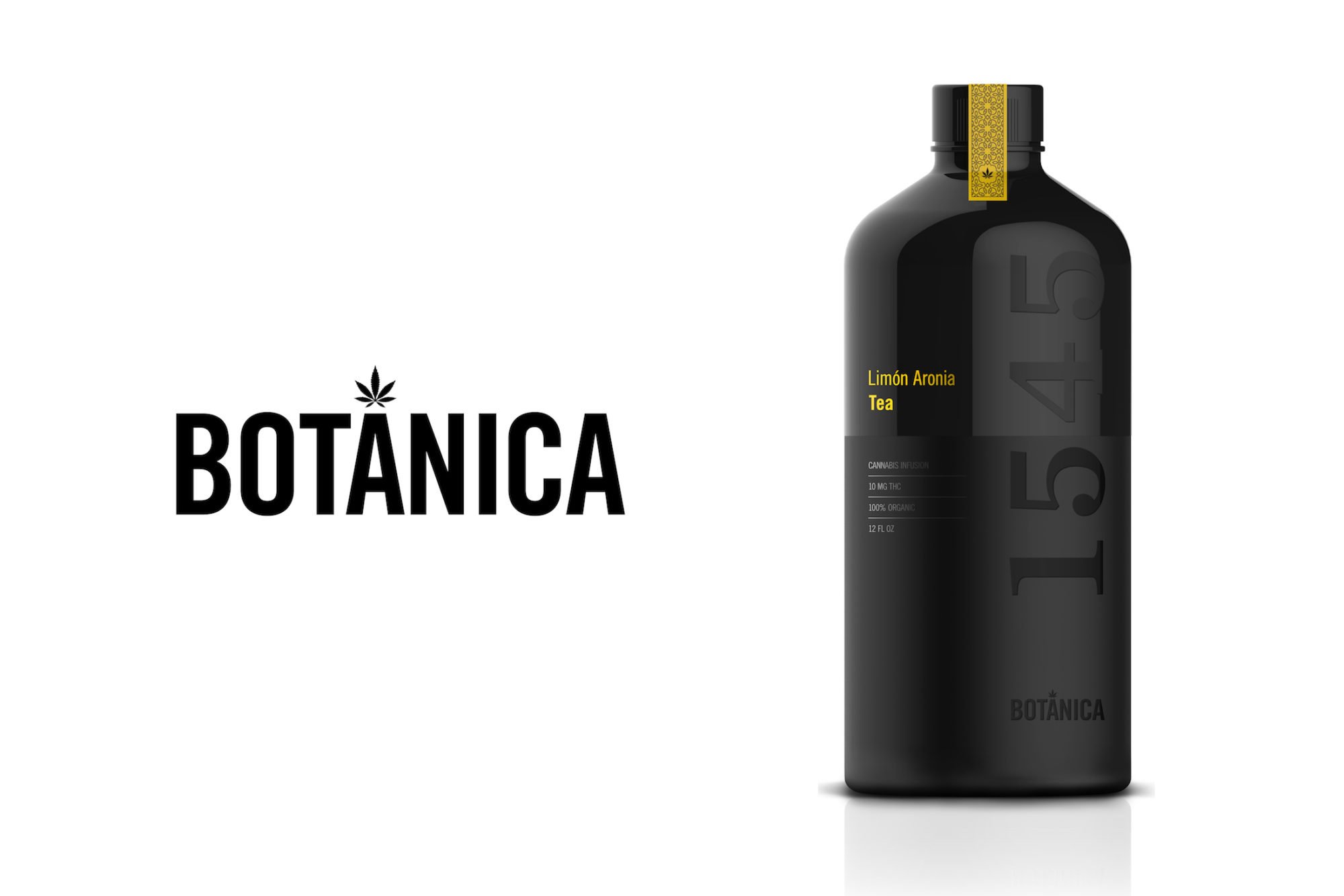
Botánica 1545 by Saatchi & Saatchi Design, New York
“Cannabis and tea are combined here to create the Botánica 1545 cannabis-infused botanical teas. The name is no accident: We chose the Spanish word for botanical and 1545 is the year cannabis officially arrived in the New World aboard a Spanish ship. Interestingly, tea—having been introduced to Europe in the 16th century from China—would likely have begun to make its way to the New World around the same time. The historical Spanish connection inspired not only the name but also the bottle form and pattern design.”
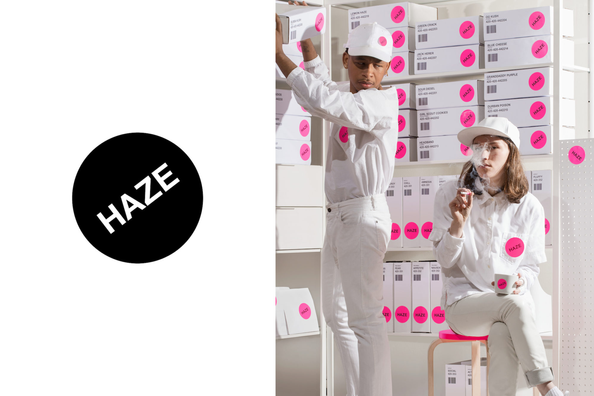
Haze by Wax Studios, Brooklyn
“We thought it fitting to respond with humor to this brief, so we created a fake Wikipedia entry on the brand, year 2036: ‘In early 2016, Green Seed Ventures, Inc., partnered with Haze Corporation to bring a $12 million capital investment to the fledgling marijuana retailer. Only eight months later, with an unprecedented 30-second-sell-out IPO of over $9 billion, Haze became the first multi-national cannabis corporation, finishing its minute on the NYSE up 2000 percent from its initial $300 share. Haze quickly diversified beyond weed-based goods to homecare, affordable fashion, server software, and financial consulting. With 1.5 billion worldwide, Haze now owns the likes of amazehaze.com (formerly Amazon.com, Inc.), Goldman Shaze (formerly Goldman Sachs Group, Inc.), and Starhaze (formerly Starbucks Corporation).’”