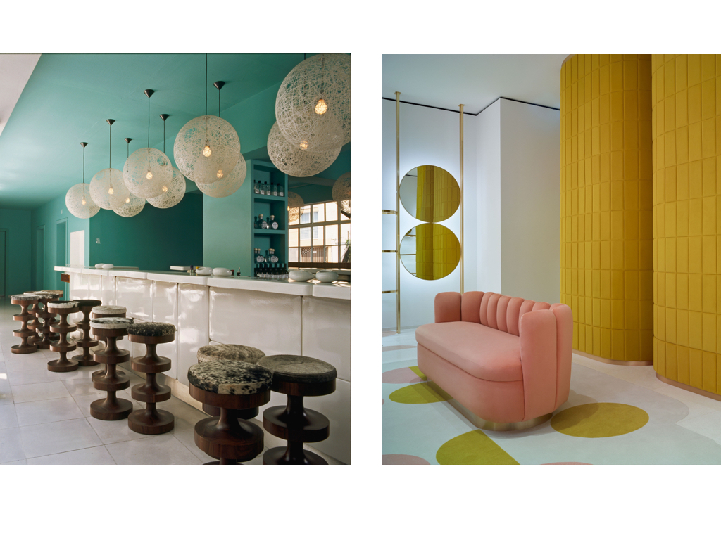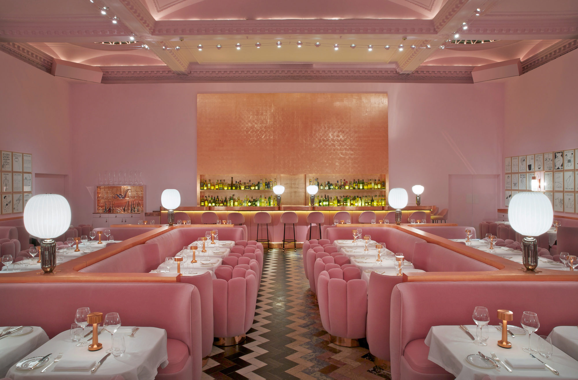
Whether it’s a bubblegum-hued restaurant in London or monarch-blue tray table for Louis Vuitton, vivid color schemes are the defining trait of everything India Madhavi touches. The Iranian-born designer’s work is notable for referencing disparate cultures and disciplines, influences gleaned from a nomadic childhood that led her from the Middle East to New England to Europe. Like a scenographer capturing the perfect frame, her passion for film reveals itself in the cinematic qualities of projects spanning the fashion, furniture, retail, and hospitality industries. But it’s her bold tones and patterns that serve as the building blocks of Madhavi’s kaleidoscopic world—an antidote to the minimal, monochromatic palette so prevalent in contemporary interiors.
It took me some time to understand why I use color the way I do. One always goes back to their early childhood memories. It’s like the story of Rosebud [referencing the fragmentary flashback effect from Citizen Kane]. I moved so many times, and my memories are mixed with photographs of that period. Now, my memories have become the material I use to create.
I remember watching color television growing up in Cambridge, Massachusetts in the ’60s—it was such a new thing. There were all of these cartoons like Bugs Bunny and Peanuts. Americans had so much color and there was something very happy about those days. Then, around the time I was 6 years old, we moved to Germany. I remember going from a very specific orange light in that part of the U.S. to the European grayness. The buildings were white and beige; the school, cars, and sky always seemed gray. Even now in my black-and-white photos from Massachusetts I can see the colors. The ones from Germany remain black and white.
After Germany, I moved to Nice, in the South of France, attending a progressive school called Ecole Freinet. There was sunshine and sea, and every afternoon was dedicated to the arts. We did everything from pottery and sculpture to theater, dance, and music. I was able to express myself through my paintings and it turned out to be the best experience of my life because everything was accessible. Color slowly came back to me. What I’m doing today is very similar to those days at Ecole Freinet because of the multidisciplinary initiatives I’m obliged to take on. Nothing is forbidden. I’ve created my environment to be very autonomous in that way.
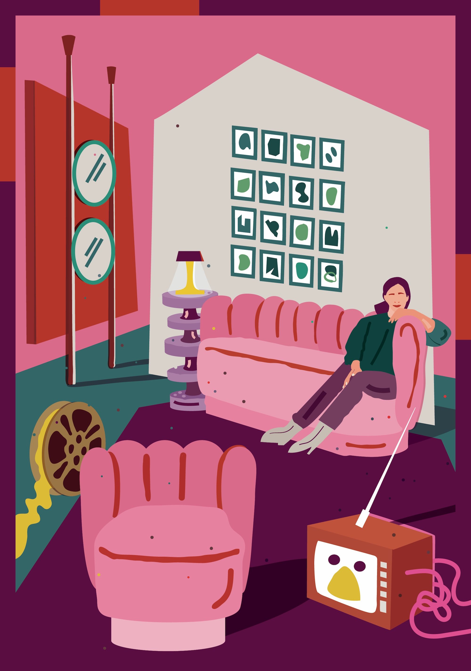
I had moved 11 times by the end of high school and was always the new person in school. So I’d run away by watching movies. Even during my first year of architecture school at Paris’s Ecole des Beaux-Arts, instead of studying I went to the movies three times a day. Movies became important to me. France had all the different genres—American musicals, George Cukor, German Expressionists. Seeing so many, one after the other, helped me understand what a frame is. My eye became sensitive to visuals and how one uses color, perspective, movement, and body within a space. It was like an in-depth training. I always take the observer’s eye to different levels, or make it stop purposefully to frame places. That comes from my movie culture.