It’s been six years since the arrival of a Duane Reade pharmacy provoked a battalion of Converse-clad protesters in Williamsburg, Brooklyn, determined to preserve the neighborhood’s mom-and-pop soul. Yet hardly a man-bun was ruffled when an emblem of extravagance, Apple, moved into a gut-renovated, redbrick behemoth on Bedford Avenue earlier this year. (Just in time for the dreaded 18-month shutdown of the already dreadful L train in 2019.)
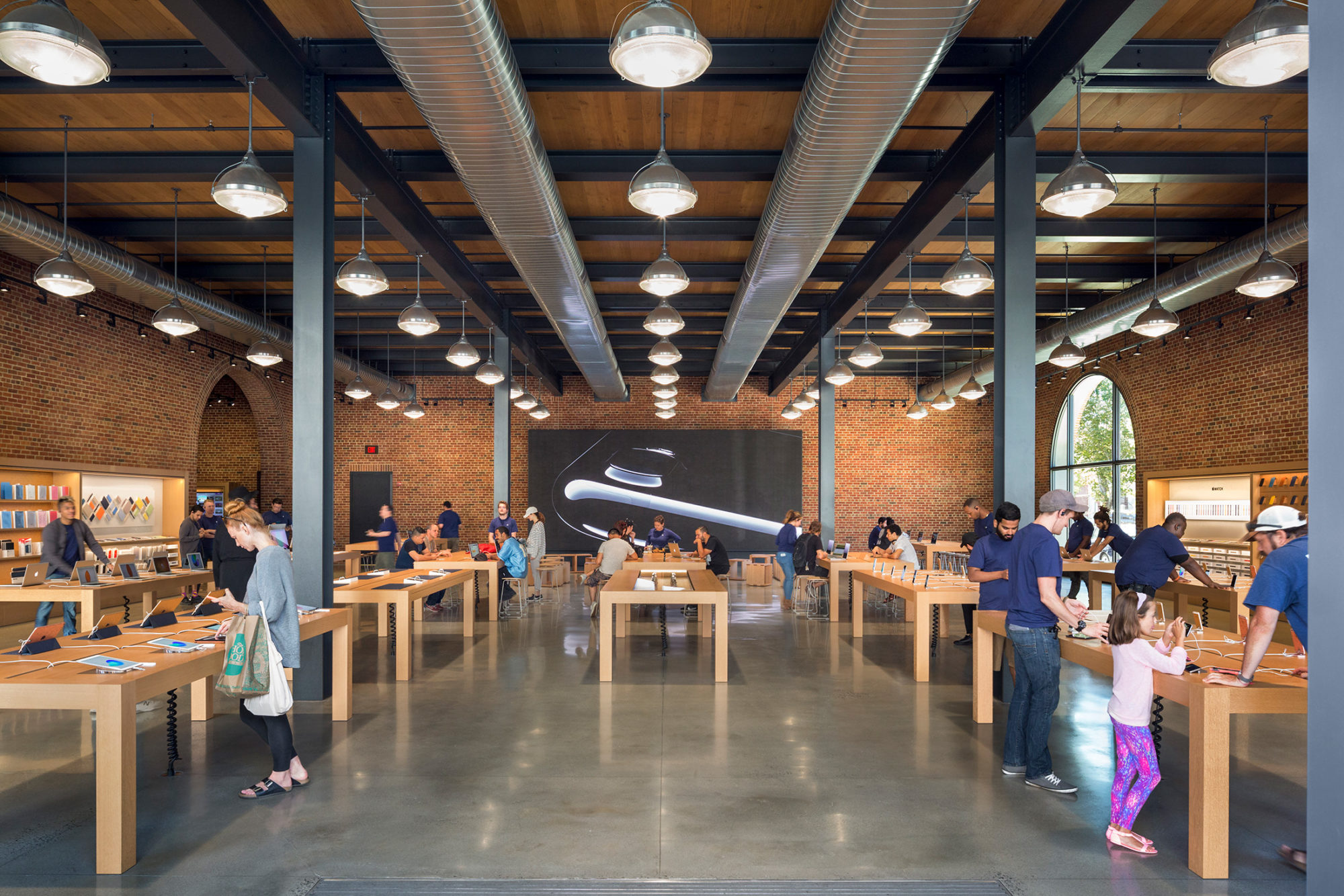
Perhaps it’s because gentrification’s grip was already strong here: The same bustling pocket contains an Equinox gym, HSBC bank, Whole Foods, and an outpost of the entrepreneur cocoon WeWork. But it could also be the reverential new space itself. Conceived by the San Francisco office of Bohlin Cywinski Jackson (BCJ), an architecture firm responsible for six other Apple outposts in New York City, the 13,700-square-foot expanse pays homage to its industrial surroundings instead of disrupting them.
“For the most part, this area has done a fairly good job retaining the historic character of its structures,” says Karl Backus, a project principal at BCJ who steered much of the design process for Apple’s first Brooklyn home. “So it didn’t seem appropriate to do something starkly contemporary.”
Fueling a raw and unvarnished vibe are factory-flavored flourishes like exposed ductwork, perforated timber ceilings and polished concrete floors, which are a marked departure from the minimalist glass-and-stone aesthetic that an Apple Store usually exemplifies. Warmth comes in the form of custom-built pendant lights (fittingly, made in Brooklyn) and charming brick archways, made to resemble those of the original masonry building. “While a fair amount of the building’s character remained, a fair amount had to be recreated,” Backus says, hinting that many of the seemingly vintage touches, like most of the bricks, were actually new constructs, meticulously color-matched to the original walls.
“There used to be a more direct correlation between the stores and the Apple products, especially when the buildings had metal exteriors, but over time, there’s been an effort not to make things so literally connected,” adds Backus. “Now, it’s more about evoking an attitude of quality and heightened refinement in both, but not necessarily mimicking each other.”
Despite the out-of-character accents, Backus insists that certain Apple signatures, like “the rhythm and sequence of introducing products,” remain. Here, though, usual suspects like pristine ivory countertops and glass display boxes were swapped for white oak surfaces—some are touch-sensitive, magically summoning power outlets and Ethernet jacks—and earthy wooden frames. “It was all about finding a sweet spot that was consistent with the sensibility of this integrated design company,” Backus says, “while also being a contextual response to the neighborhood.”
