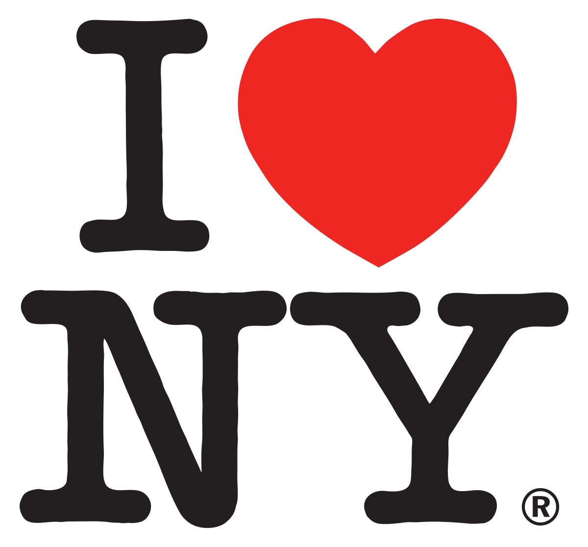
In the late 1970s, New York had reached a nadir. The city had barely scraped through a major fiscal crisis. A widespread blackout provoked looting and arson. Son of Sam loomed large. The Bronx was burning. Amid the chaos, Milton Glaser sat in the back of a taxi and sketched what would become the I ❤️ NY logo after being commissioned for a tourism campaign. The late graphic designer loved New York so much that he gave the logo to the city for free, hoping it would become public property.
Glaser’s napkin doodle has since become inextricably linked with New York City’s identity, its Robert Indiana–like foursquare arrangement etched into our psyche thanks to souvenir shops emblazoning the logo on everything from T-shirts and mugs to teddy bears and G-strings, not to mention spawning countless imitations around the world. In a 2018 interview with Surface, Glaser described it as “the most successful thing I ever did. It reflected a certain desire in our population, something people wanted to express. They wanted to say, ‘I don’t want to move out. I love New York.’ It wasn’t a logo. It was a cry for acknowledgment.”
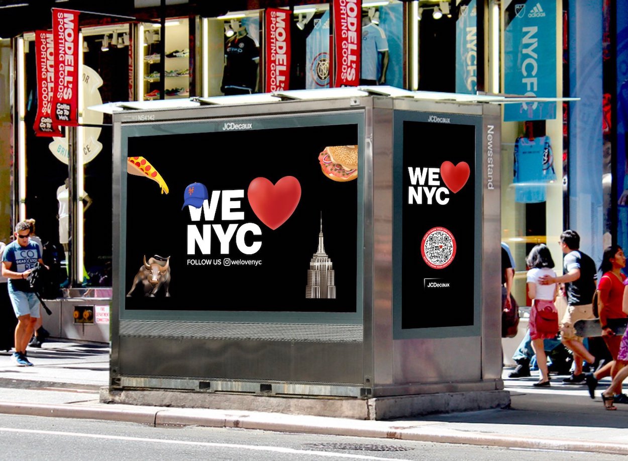
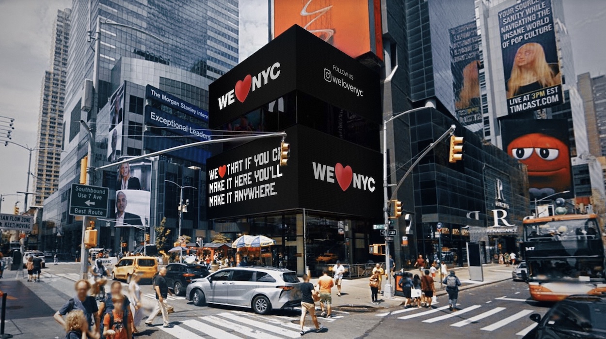
Partnership for New York City, a consortium of business executives, corporations, and elected officials, had started drawing parallels between the late 1970s and today. (Both can be viewed as watershed moments as the city rebounded from divisiveness and economic woes.) To help promote their latest campaign that encourages locals to “fix what they see as broken in the city,” as president Kathryn Wilde notes, they decided to modernize Glaser’s logo to reflect the current times. That entailed swapping in a protruding heart emoji and replacing his typewriter doodles for sans serif caps referencing Helvetica, the font on New York City subway signage.
Helvetica, it turns out, also graces the city’s garbage trucks. And according to the scores of New Yorkers who took to Twitter to share their shock, anger, and confusion at the campaign, that’s exactly where the logo belongs. “Don’t mess with perfection” was the consensus, but to say the design was skewered is putting it nicely. Some thought it could have been made in Microsoft Paint; others questioned its readability, pointing out the text could easily be interpreted as “We NYC ❤️.” Ben Stephens, a freelance copywriter, described it as “lopsided and incoherent,” likening its voice to that of “an investment bank or possibly a healthcare provider.”
That’s where the new campaign falls short. Glaser’s logo came about serendipitously, a spur-of-the-moment flash of genius whose simplicity speaks for itself. Partnership for New York City spent upwards of a year finessing their concept, and while the underlying message is one most locals could heed, the “marketing try-hardism” is hard to ignore. As Elissaveta M. Brandon writes for Fast Company, “replacing Glaser’s logo with a beating-heart emoji seems more heartless than helpful.”