These Color Palettes Will Take Your Mind Off the Madness
Sherwin-Williams has released its 2020 color trend report, which it promises will bring joy, serenity, and focus to the mind, body and spirit. For those like us with an interminable sense of existential dread, we unpack each palette to see how they can quell your anxieties.
If there’s one uniting issue left in polarized modern life, it’s the shared sense of existential doom. The plastic waste crisis, dismantling of the postwar order, hygge—it’s no wonder CBD is the must-have accessory of the season.
Luckily, Sherwin-Williams is here to soothe our anxious energies. The global paint brand’s team of researchers and color theorists recently wrapped up their annual intensive study into color, design, and pop culture trends to build a collection of simple palettes guaranteed to lighten your #mood. Even the descriptions are meditative. “We expect 2020 to be an empowering year of change that will focus on bringing your best self into the new decade,” says Sue Wadden, the brand’s director of color marketing, pronouncing warm, natural hues as next year’s vibe du jour. “When invited into our spaces, the colors in these five palettes pave the way for wellness and self-nurturance.” Which one is right for you? Depends on what keeps you up at night.
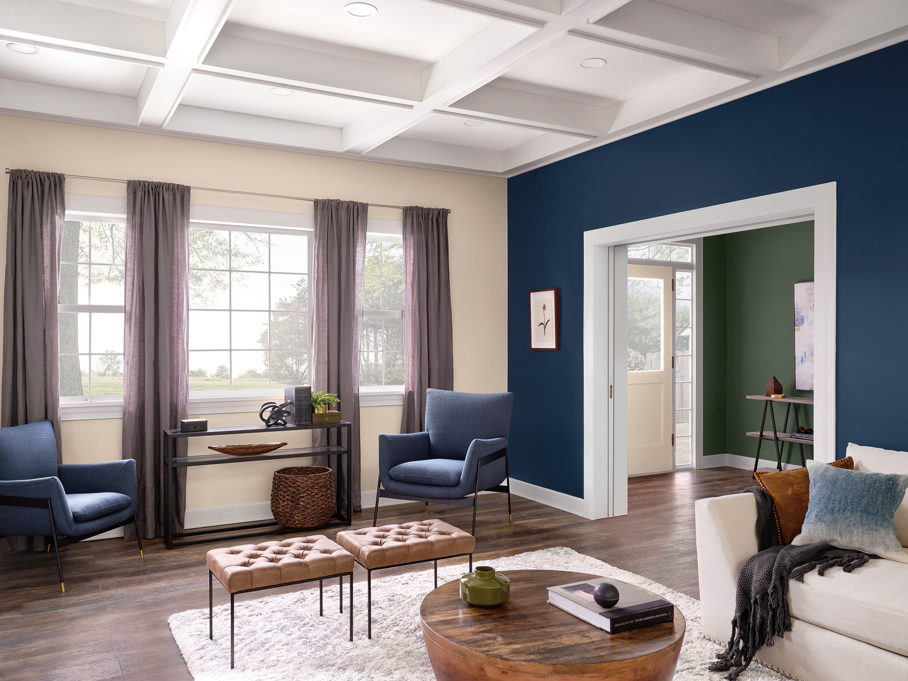
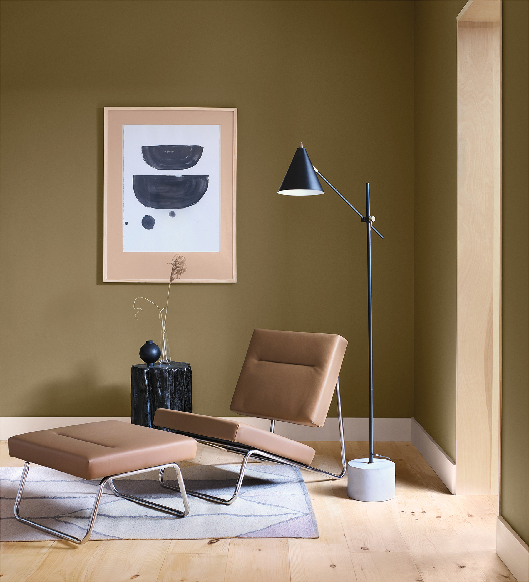
Alive
Channeling “optimistic and authentic vibes,” this palette encourages us to “soak up the present and live in the moment.” These nurturing neutrals, which artfully coalesce with rich blue hues and a deep ripe olive, will surely assuage fears of human civilization’s impending extinction in 2050, if even for a moment. Optimistic, indeed.
…
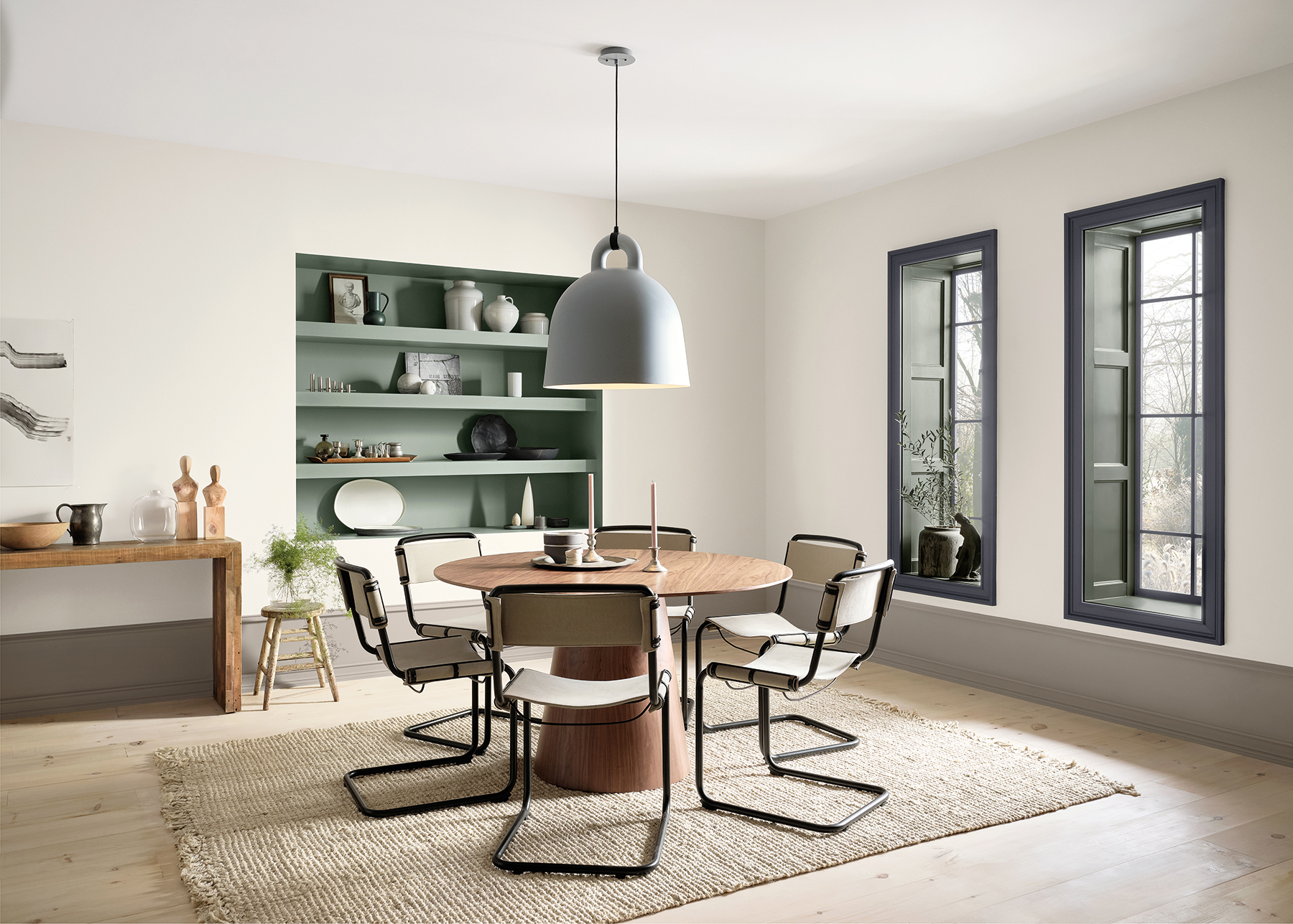
Haven
“Like being welcomed home with open arms, this nature-inspired palette beckons to those who seek to transform their space into a personal oasis. Drawing upon Earth’s seasonal cycles, it features rich, subtle shades of sea, sand, forest, and sky to organically bring the outdoors in.” We recommend bringing the outdoors in fast—humanity has deforested 55% of the world’s trees, and half of the Great Barrier Reef is dead. On the bright side, Denver just decriminalized magic mushrooms, which may make Functional Gray as effervescent as the Great Barrier Reef before the Industrial Revolution.
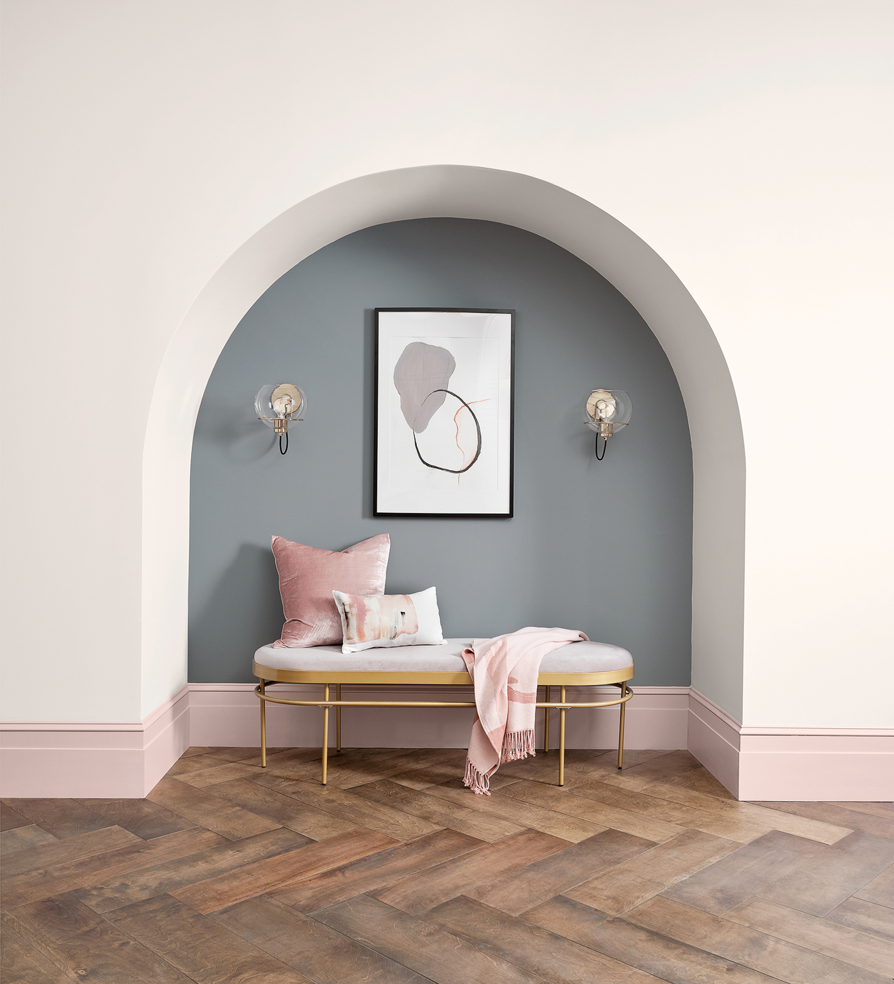
Mantra
“East meets West in this serene collection of softly muted neutrals that glide from warm to cool. Nordic simplicity entwines with the pared-down elegance of Japanese aesthetics to create a look that keeps it simple.” This palette is perfect for anyone needing a moment of Zen while battling the bubonic plague contracted from an antivaxxer’s toddler, or suffering from burnout, the World Health Organization’s newest chronic condition. Either way, your healthcare doesn’t cover it.
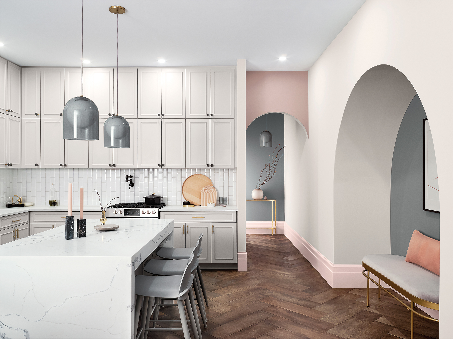
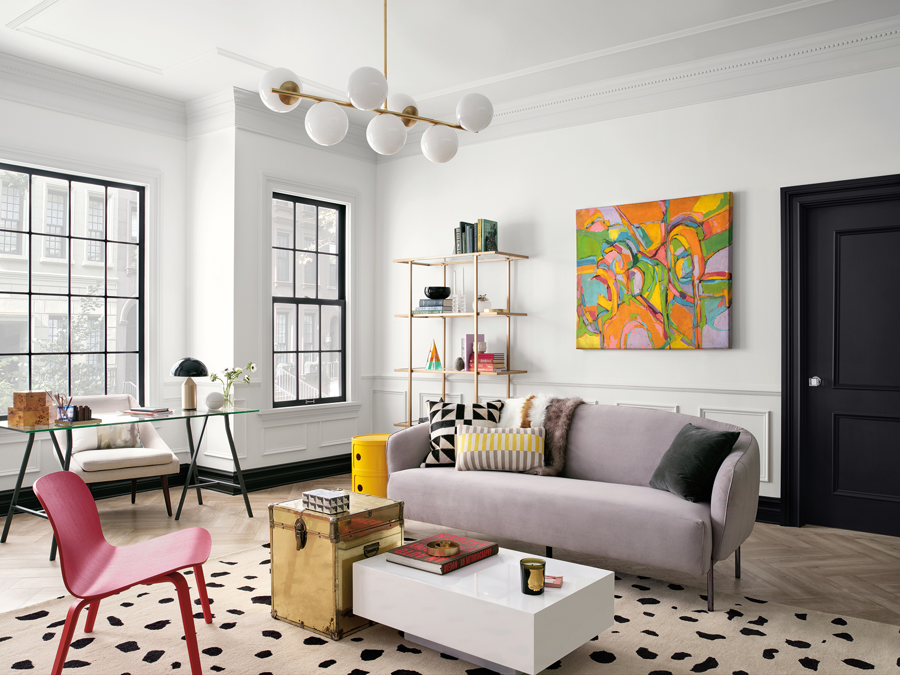
Play
“This energetic palette exudes charm through buoyant color. Anchored by a fresh, pure white, it’s peppered with pops of bright pink, aqua, and gold and balanced through monochromatic neutrals.” We find this range to offer a welcome sense of whimsy at a time when California’s overworked, largely migrant vineyard farmers are unable to satisfy the staggering rosé demand in The Hamptons.
Heart
“A confluence of genres and emotions, Heart is a one-of-a-kind fusion of modern design with intergenerational boho vibes. From silky neutral tones to clove and soft coral, these hues are a meditation in comfort, connection, and pleasures found in the everyday.” Relish in life’s little pleasures while you have sufficient funds—a recent CNBC report suggests millennials will squander over $1 million on indulgent, caffeinated consciousness over their lifetime. You won’t even remember that million bucks when your bedroom walls, swathed in the tone Likeable Sand, transport you straight to Tulum.