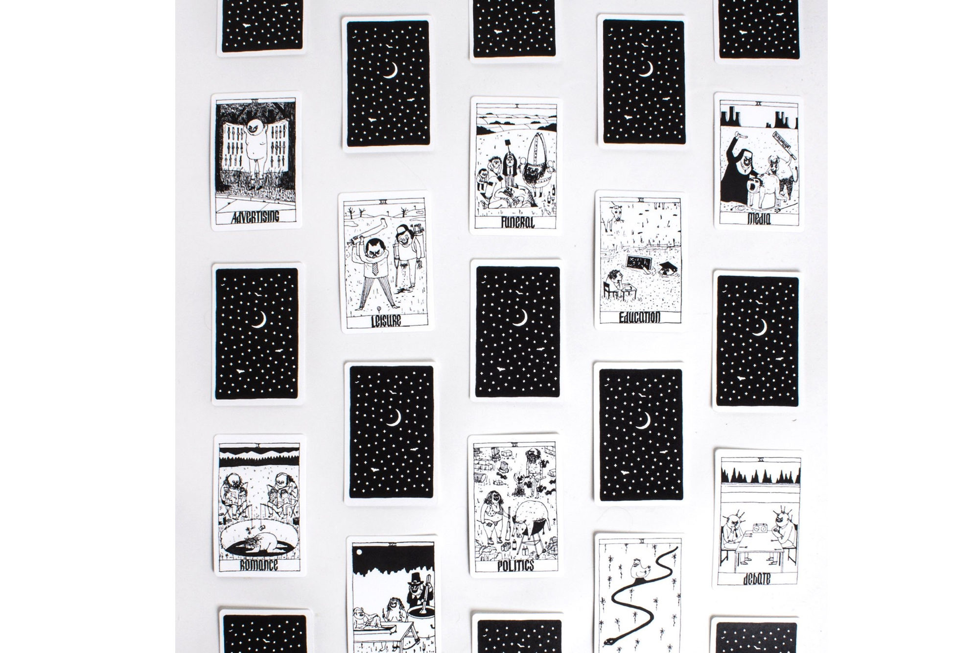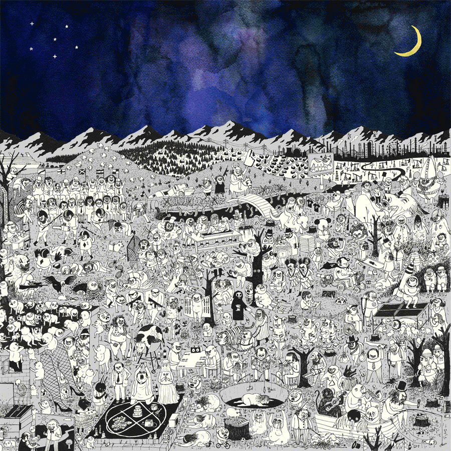
Earlier this year, when Josh Tillman, a.k.a. singer-songwriter Father John Misty, needed a sleeve designed for his new album Pure Comedy—his sardonic meditation on contemporary life—he called on an illustrator with a similar grasp of tragicomedy: Edward Steed. For the past four years, Steed’s cartoons have littered The New Yorker with succinct, oblique humor, and with characters and situations that lay bare life’s many follies. His uncanny aesthetic is on full display in the album’s cover design—a sprawling, scrupulously detailed canvas populated with odd figures and bizarre takes on modern-day rituals, from romance to advertising. Below, Steed explains how the project came to be.
How did you come to work with Father John Misty for Pure Comedy? Were you familiar with his work before this?
I didn’t know his music, but he sent me his old record, I Love You Honeybear, and the first track from Pure Comedy. He had seen my cartoons in The New Yorker, and wrote me an email saying he liked my work, and thought that my style would suit the new record. There were some similarities in our worldview, and I didn’t have to adjust my style to suit him.
Did you have a brief for the album cover? What were your own intentions for it?
He had this idea of four different-colored skies, and just asked for a drawing to go [with] that. I sketched lots of small scenes—sort of satirical in tone but not literally referring to the lyrics—and then arranged them on a landscape. I suppose the unifying theme is the absurdity of human life on earth. Mostly, I was just trying to make something that’s good for people to look at while listening to the record. I just drew the type of album cover I would want if I made an album, which I never will.
What was the process of creating this intricate artwork?
I spent a few weeks sketching ideas for individual scenes and characters. This was similar to the way I usually work doing single-panel magazine cartoons. Arranging them in a context of a large landscape took a while. I’d never drawn anything at that size before, and to do the final drawings took about a week. It’s all in ink, and I used a metal-nib pen, the kind you dip in ink.