Uniqueness
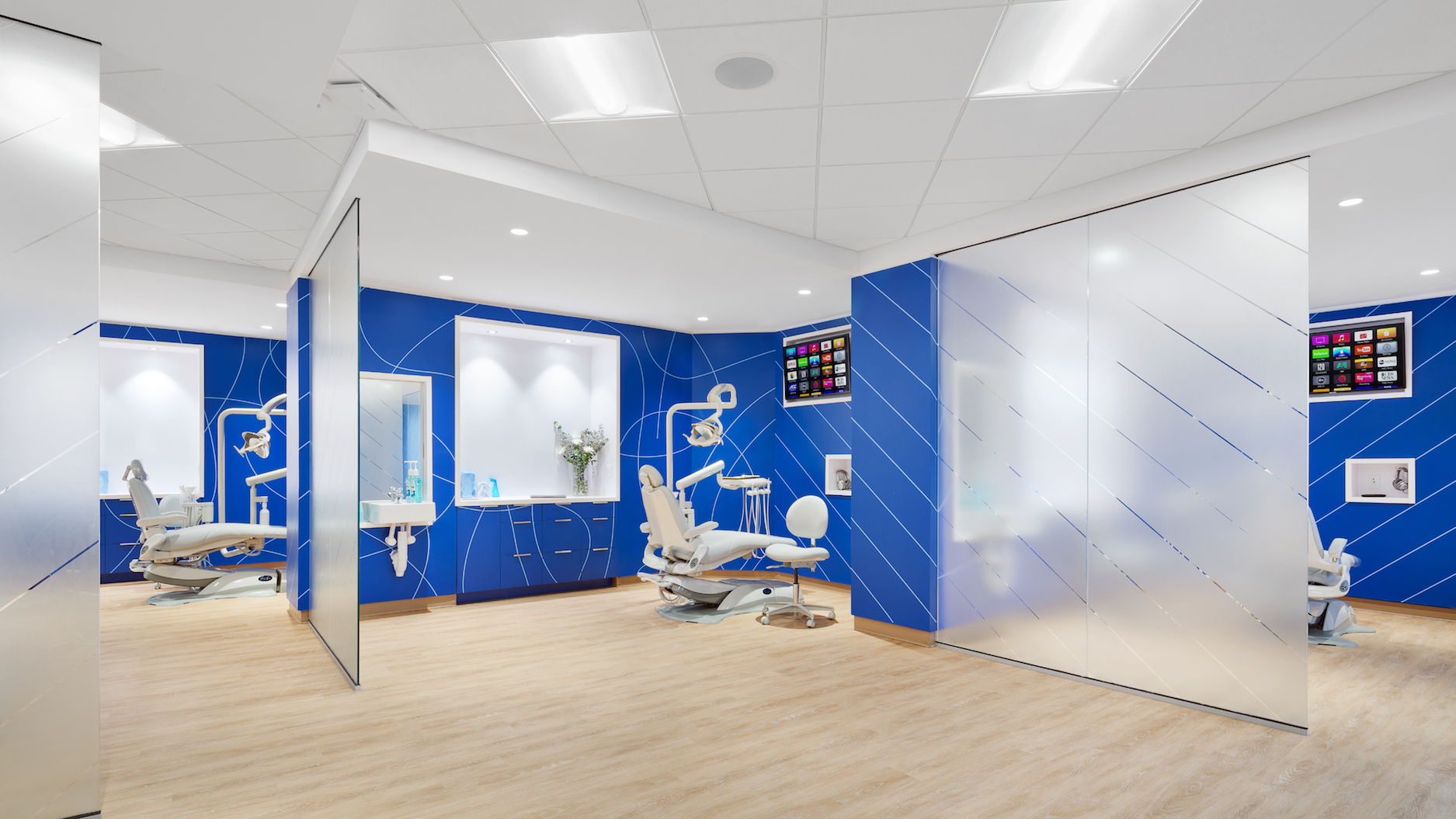
HTD: We chose an open floor plan, with open bays as operatories. This is both unique to dentistry, as most rooms are closed, and also mimics our mobile practice environment. To separate the operatories, we placed glass walls between each. Hinterland used frosted vinyl with our inverse floss pattern to allow light through while maintaining a sense of privacy.
Heitler Houstoun Architects: HENRY is exactly the kind of project we love: partnering with a client who is intentionally trying to disrupt an industry and create something entirely new and ownable. While we were previously able to successfully accomplish this in the unique mobile environment, the challenge was to bring that same feeling of surprise and delight to the more familiar clinic setting. To achieve this, we replaced the typically bland and boxy treatment rooms with angled and glass partitions and utilized a material palette of warm wood tones and bright, brand colors not usually found in clinical environments. Overall, the design is carefully calibrated to project both a high level of established professional expertise, as well as the warm, welcoming nature of the brand. The same general palette is woven through the adjacent office spaces to reinforce the important continuity and connection between the corporate planning and patient facing work of the company.
Takeaway
HTD: Our patients already have that “wow” factor when they walk in. It’s welcoming, upbeat, and totally unexpected for a dental office, and it immediately puts them at ease. From the moment a patient enters the clinic reception area, HENRY’s core mission is clearly reinforced: this is not your parents’ dentist office, and the experience has been improved at every step.
The reception area includes easily accessible stations to get headphones, drinks, and snacks, as well as carefully curated retail items. The treatment areas are larger and expanded versions of the mobile pods: private, individualized, semi-open rooms carefully crafted with patient-driven amenities such as Netflix- and HBO-streaming TVs, noise-cancelling headphones, in-room sinks, and convenient spaces for personal belongings and phone charging. Equal design attention was given to the details on the dental side, with state-of-the-art equipment organized to efficiently support great service and treatments. The office area space was designed to promote creativity and collaboration with glass-fronted private offices, open-desking, flexible conference spaces, and a larger central “kitchen” space and lounge for informal meetings and office-wide gatherings.
HHA: HENRY presented a great opportunity to develop a physical design concept in parallel with the evolution of the overall brand and graphic identities. Through close collaboration, core elements of the identity which are featured in print, web, and collateral materials were seamlessly integrated into the interior design in colors, materials, graphic patterns, and signage. One of the overall goals of the brand is to make something traditionally dreaded—a trip to the dentist—a more enjoyable and positive experience. Incorporating the branding elements was a key tool in building the desired playfulness and whimsy into the interior environment.