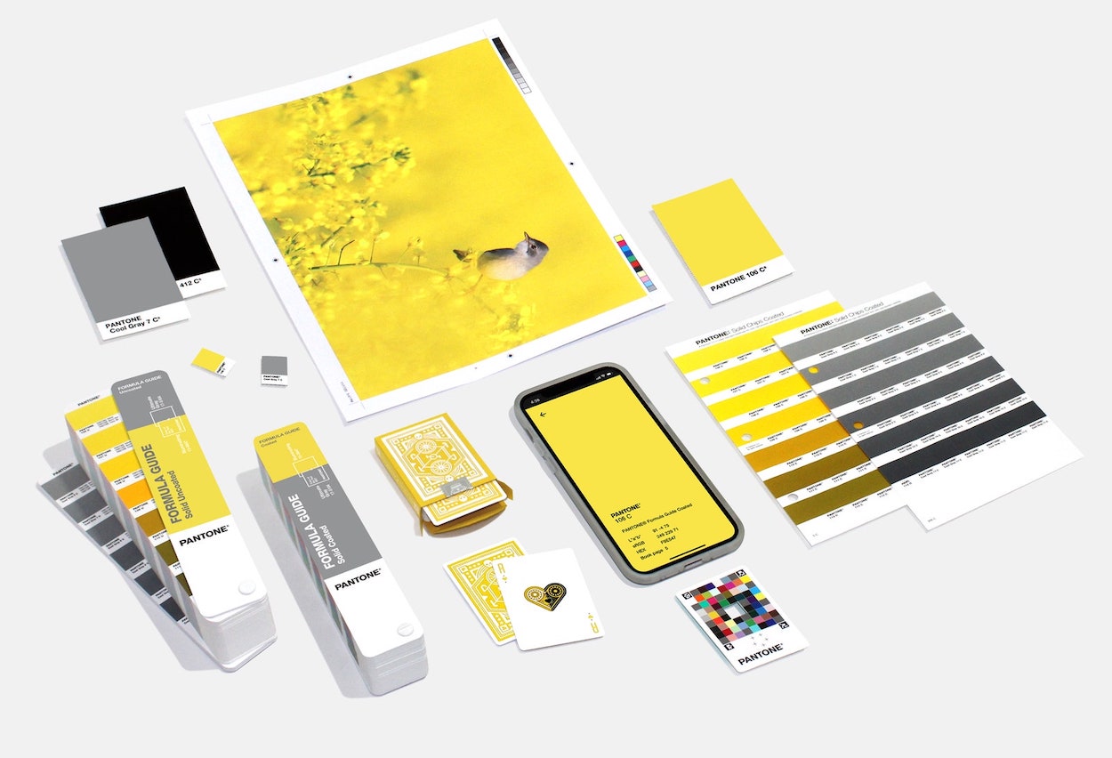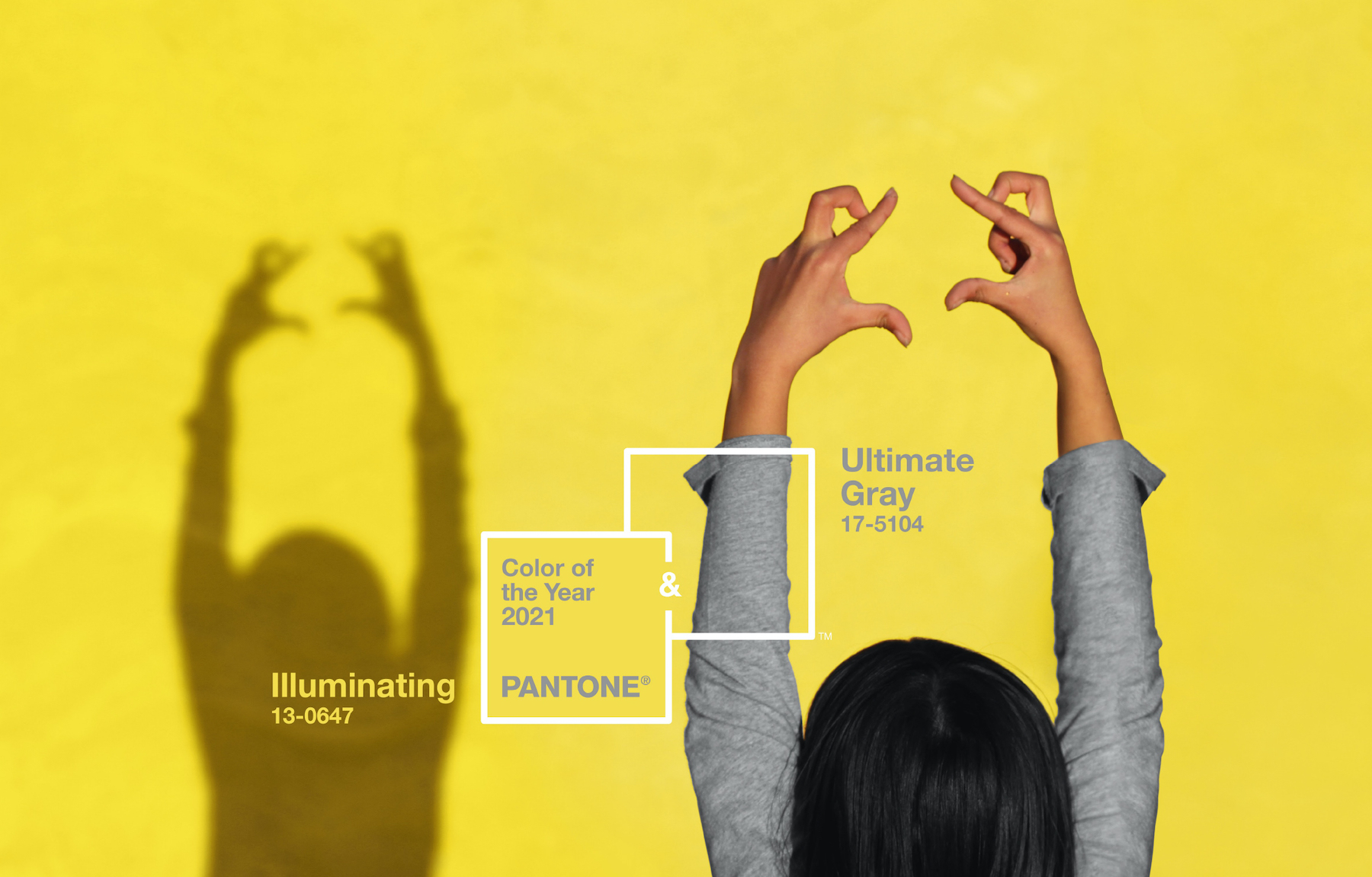
What’s Happening: In a surprise move that actually seems somewhat sensible all things considered, Pantone has selected two Colors of the Year: “Illuminating” and “Ultimate Gray.”
The Download: If we can all agree on one thing, 2020 has been one of the bleakest years on record. Life has been completely upended by the coronavirus pandemic, and the murders of George Floyd and Breonna Taylor illustrated how much work remains in the fight toward racial equity. While Pantone’s trend forecasters originally picked the ebullient “Illuminating” yellow to encourage a sense of optimism after a rough year, it didn’t quite feel right.
Pantone Color Institute creative director Leatrice Eiseman gave it a rethink, ultimately deciding to pair the sunny shade with the granite-like “Ultimate Gray.” The colors are complete opposites, and that’s the point—think of the sun rising over a mountainous vista. Described by Pantone as “practical and rock solid but at the same time warming and optimistic,” the two shades encapsulate a somber mood with the promise of sunnier times on the horizon.