Sabine Marcelis reimagines the Vitra Design Museum’s vast holdings by color, flexing her curatorial eye while revealing previously unseen intricacies within the modern design canon.
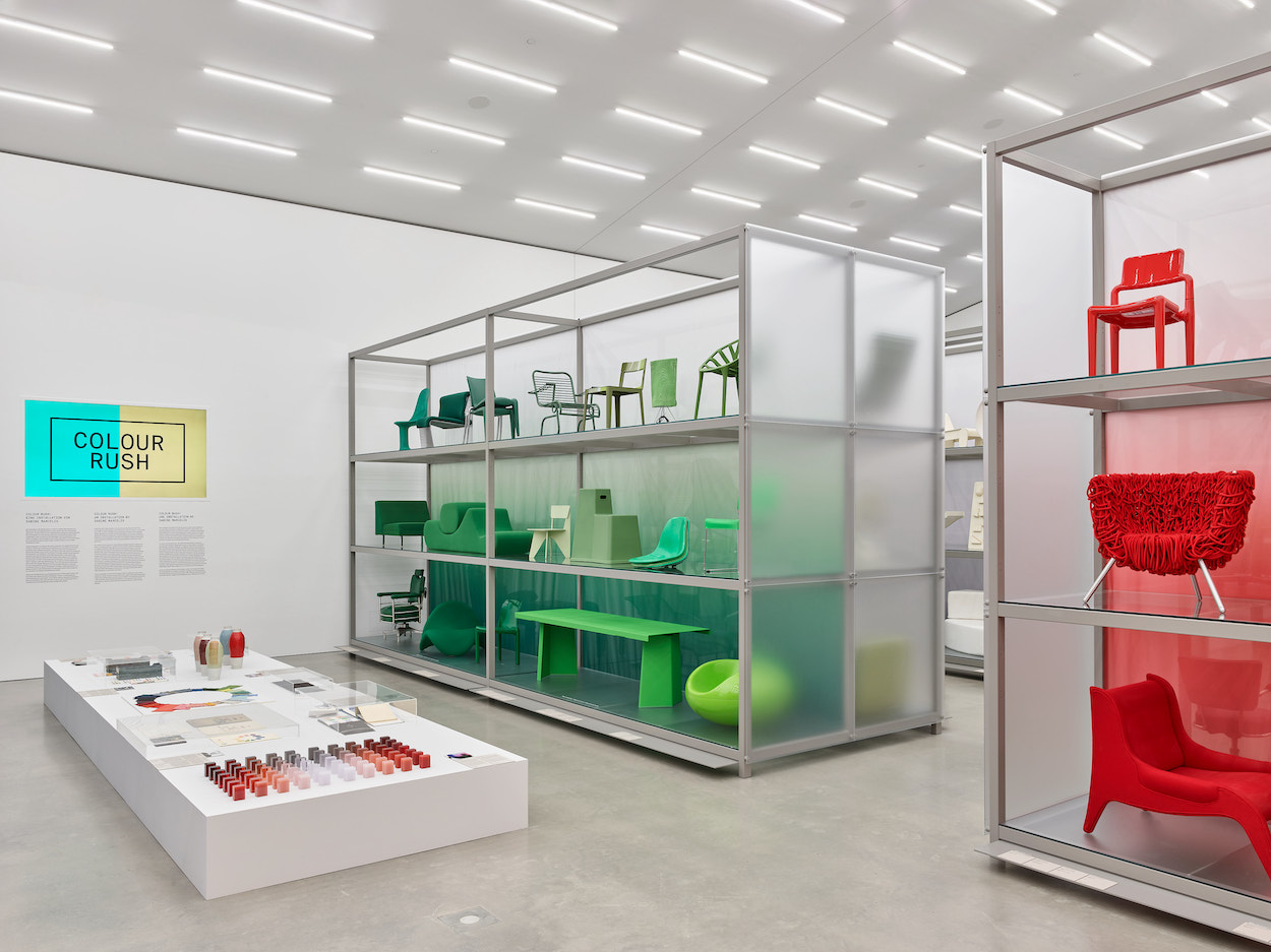
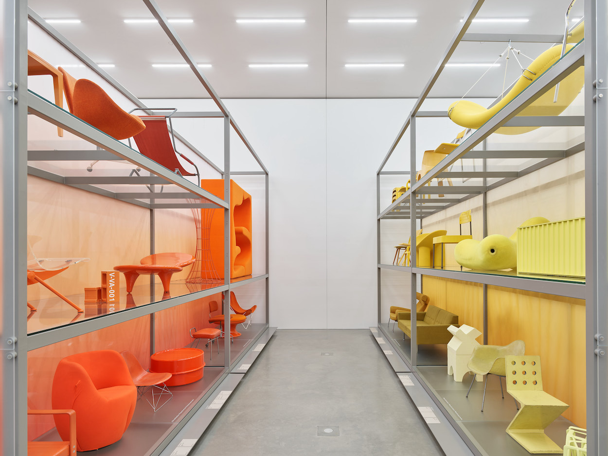
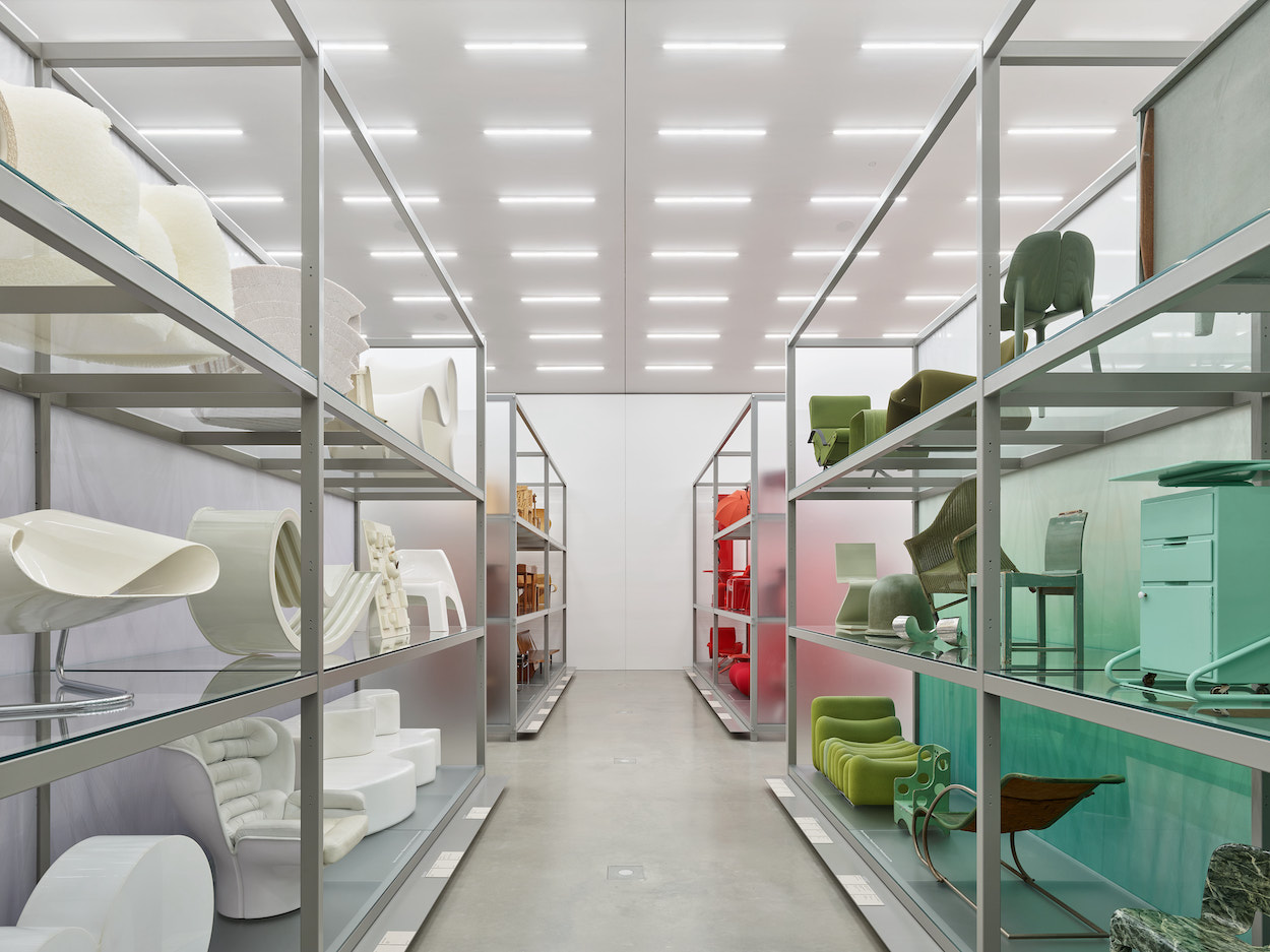
“Colour Rush,” an installation by Sabine Marcelis at the Vitra Schaudepot. Photography by Mark Niedermann, courtesy of the Vitra Design Museum…
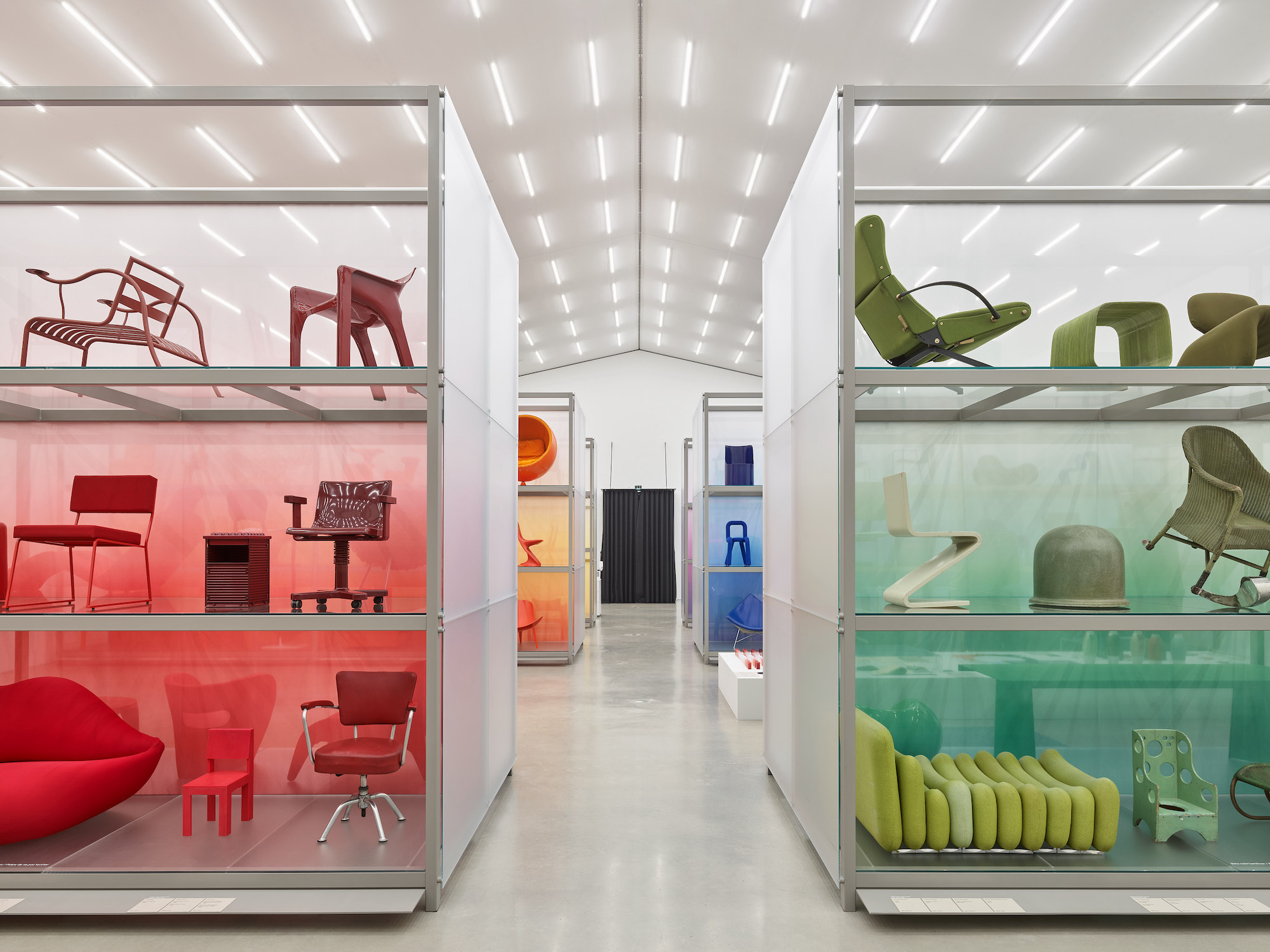
The Vitra Schaudepot contains one of the world’s foremost collections of modern furniture, coming close to a sacred space for design enthusiasts. Hundreds of key pieces ranging from the 1800s line the depot’s shelves, highlighting such design greats as Modernist masters Le Corbusier and Gerrit Rietveld to forward-thinking 3D-printed objects and prototypes from the Vitra Design Museum’s vast holdings. Located inside a monolithic red-brick building by Herzog & de Meuron at the sprawling Vitra Campus in Weil am Rhein, Germany, the archive functions as a living history of furniture design from the 19th century onward.
The Vitra Design Museum occasionally likes to shake things up, so they enlisted none other than Sabine Marcelis to rearrange the Schaudepot’s holdings based on bold use of color. That’s no easy task: from the institution’s vast archive of 7,000 fixtures of modern furniture design, which are arranged chronologically, only 400 could make the cut.
Marcelis, who hails from New Zealand and now runs a product design studio in Rotterdam, turned out to be an ideal collaborator. “I wanted to approach this how I work in installation and object design, in which we make one bold statement,” she says over Zoom. “Often a single strong gesture makes my work what it is.” So she applied that same logic to the exhibition, called “Colour Rush,” which opened this weekend and will remain on view until May 2023. The newly reimagined Schaudepot features furniture of different styles and colors shown against translucent backdrops in various shades, creating a breathtaking gradient effect and an immersive experience that conveys a thorough grasp of modern design’s colorful history.
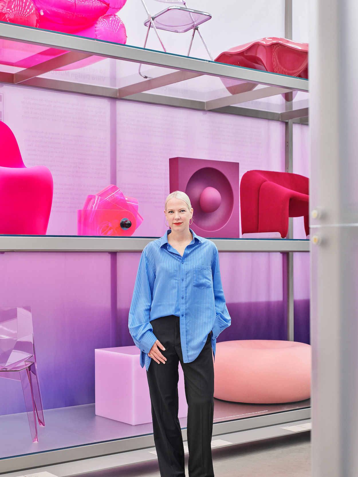
And Marcelis is part of that history. Her signature Candy Cube was recently inducted into the Schaudepot’s permanent collection, adding a welcome dose of saccharine flair to archives that can feel largely defined by Scandinavian minimalism and tubular steel. She reached that milestone by rigorously pursuing her ongoing material experiments, mostly involving how reflections of light and water highlight glass and resin’s dazzling translucent properties. Her lustrous pieces are coveted by collectors and Instagrammers alike and have propelled her to de facto design stardom over the past decade, landing her high-profile commissions for the likes of Fendi, Burberry, and Aesop, among others. Lorde—a fellow Kiwi and noted synesthete—even counts herself a fan, performing alongside a Candy Cube during her 2017 Melodrama tour.
We caught up with Marcelis, who walked us through how she kept her cool while facing the immense task of seeing “Colour Rush” through to completion.
Sabine Marcelis with her Candy Cube and Boa Pouf. Photography by Mark Niedermann, courtesy of the Vitra Design Museum…
Can you recall the first time you experienced the power of color, whether in design or in general?
I’ve never been asked that! I spent many years snowboarding and recall being amazed at how colored goggles affect the experience of space around you. Flat light makes it difficult to discern depth, or the difference between the sky and the snow, but red glasses filter light differently so you can see much more of it. If it’s sunny out, you can wear reflective goggles so the light bounces off. That was something I was super fascinated by when I wasn’t doing anything design-related yet; I started studying design when I was 21. That was for sure an early inspiration for how I work now, which is filtering light through color, and vice versa.
So snowboarding planted the seed for some of your future work!
For sure, and seeing how the sky behaves above sea level on the slopes. Often, when snowboarding in New Zealand, I’d be above the cloud blanket. I’ve always appreciated my surroundings when snowboarding, and I still try to capture that type of nature in my work.
When Vitra came calling, what were some of your initial ideas? Did you already know you’d focus on color?
On my brainstorming call with Mateo [Kries, director of the Vitra Design Museum], we very quickly landed on color as a theme. I don’t mean this in a negative way, but I don’t design from a super academic or philosophical point of view. I try to work with materials and push limitations within that. Often a single strong gesture makes my work what it is.
I don’t have experience doing museum scenography at all. Within that setting, often what’s being presented is heavier and more academic. I wanted to approach this more how I work in installation and object design, in which we make one bold statement. Here, the collection is categorized by color, which strips away each object’s other characteristics, creating more freedom to interpret the pieces when they’re placed next to each other. You can have an early 20th-century chair next to an object designed last year. You get interesting juxtapositions of material differences. I wanted to be singular in the gesture and make sure it was powerful.
“Colour Rush,” an installation by Sabine Marcelis at the Vitra Schaudepot. Photography by Mark Niedermann, courtesy of the Vitra Design Museum…
The exhibition guide mentions some cross-references between periods and styles now that all the furniture is arranged in a new context. What were some of your most interesting revelations while going through this process?
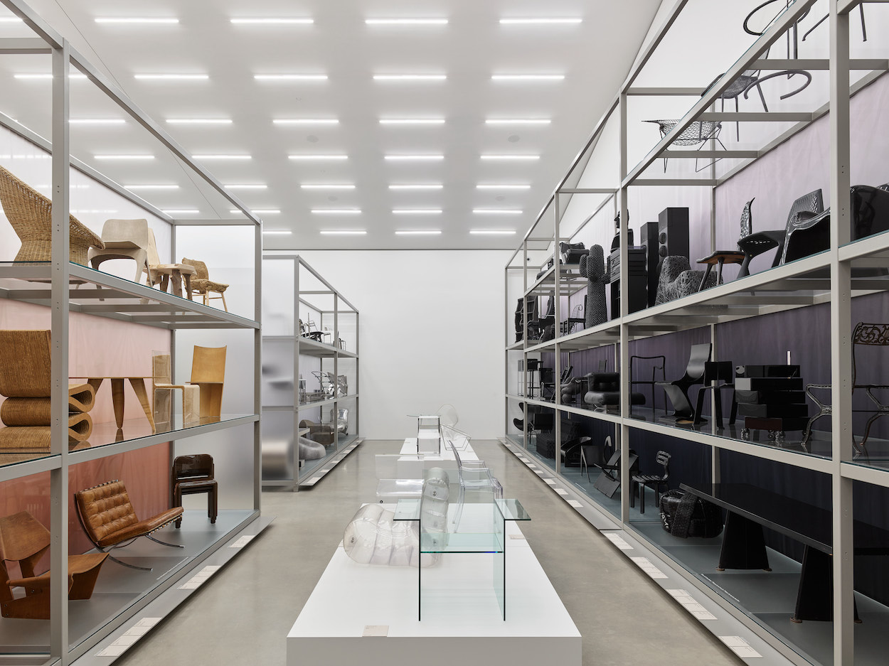
I’ve never been a huge fan of brown as a color, but the exhibition’s brown section might be my favorite. When you think of brown furniture, perhaps the first thing you think of is a leather sofa or wood, and it ends there. Our section has a wooden television next to a chair made of Plexiglas and filled with corn grains. When things are grouped by color, the most interesting part for me is unpacking the diversity in materials that share the same color scheme.
The museum’s collection spans continents and time periods, but there’s very little green and blue, and especially little pink and purple. We struggled to fill those colors, but there’s an abundance of red and black. You could do this entire exhibition just in the color black. If anything, it says that black and brown are both timeless. So are objects that are true to their material. There’s a ton of metal furniture—we have a gray section that’s almost primarily metal without coating, closely followed by warm colors.
The collection has around 7,000 objects, but “Colour Rush” only contains 400. Can you tell me about your selection/curation process? What specific qualities, besides color, were you looking for in the objects that were included?
We had to start with some restrictions, because 7,000 pieces is an insane amount! Diversity was the first point. We wanted to represent all the continents and include as many pieces by women as possible. We were also strict about how color was used on the object—so many pieces have several colors, or a pattern, or a touch of one color. We didn’t consider those. We only looked at designs that are completely in one color, or with a supporting metal structure, or a touch of neutrals. That brought the number down significantly. Then we tried to include the most interesting and iconic pieces, and pieces that are important for whatever reason.
What was the biggest challenge of seeing through a project of this scale and significance?
It’s a responsibility, but that’s why I didn’t want to have a loaded concept. There’s not much to comment on other than color. The biggest challenge was that the archive has images of each object, but they’re often of poor quality or misrepresent the color or scale. We worked from this huge document containing all the pieces and tried to understand from a flat, bad-quality image how it might look three dimensionally. Some pieces turned out to be way bigger than we thought from the 2-D version.
I’m used to being tactile with everything. I’m much better at experiencing and designing with materials in front of me. Of course we went to the archives and saw the pieces stored on the shelves. Putting together the show solely on the computer for such a long time isn’t easy!
“Colour Rush,” an installation by Sabine Marcelis at the Vitra Schaudepot. Photography by Mark Niedermann, courtesy of the Vitra Design Museum…
Now seems like an ideal time to see a project like this through because Vitra semi-recently published the Atlas of Furniture Design.
Absolutely! We had that on the table constantly.
Documents from Vitra Design Museum archives by the likes of Verner Panton, Alexander Girard, and Hella Jongerius accompany the show. How have these designers influenced your perception of color?
We have a section of color studies by designers. Color is such a huge topic, so we wanted to present some additional material. We were quite strict about what to include: It has to be by a designer and show how they’ve either made a color study or how they’ve interpreted color in a certain way. There’s obviously a physical law to how color works, so the designer’s role is to give that additional meaning by placing colors together.
There’s an enormous collection of Verner Panton here. He has such a big body of work, and so much of it is genius. One of my favorite pieces is a big orange version of the Living Tower. What’s been the most fun about putting this show together is comparing apples to oranges. The Living Tower is thinking about how people can be together on a piece of furniture, which is super interesting and revolutionary and other pieces are more about an optimized production process.
I’ve always treated color not as something solid or permanent. I think of Light and Space artists like Helen Pashgian and DeWain Valentine, whose use of color is inspiring because they work with the depth of color through resin and glass. Their use of color gives so much more dimension because it plays with the intensity all within one object.
I also made a color study for the Vitra Schaudepot, in which I took one color as a resin block and unpacked it in a group of 70 different blocks. It starts with the color itself and moves into adding more white or black into the recipe with decreasing intensity and saturation. It shows how color can react within one material, how it can change the experience of that material, and how one experiences color if the material is polished or matte. These handlings affect perception of color within material. That’s where my main color fascination lies.
“Colour Rush,” an installation by Sabine Marcelis at the Vitra Schaudepot. Photography by Mark Niedermann, courtesy of the Vitra Design Museum…
“Colour Rush,” an installation by Sabine Marcelis at the Vitra Schaudepot. Photography by Mark Niedermann, courtesy of the Vitra Design Museum…
After “Colour Rush,” do you think you’ll approach color differently in your work?
I don’t know! I haven’t thought about that. I haven’t had any huge revelations regarding color yet. “Colour Rush” is so different compared to how I normally work. It’s more an exercise in categorizing rather than creating. Most of the designs on view are chairs or sofas, so the best part is seeing how many different ways designers have interpreted a seating element. It’s a celebration of creativity in that there are endless ways to reinterpret that singular object.
What do you hope visitors will take away from seeing the collection presented in this new light?
I just hope it’s an easy-to-digest way to see many different designs, and that it showcases this history of creative genius through interesting juxtapositions. One example is a children’s chair for using the toilet that’s right next to a super ‘60s Joe Colombo piece. I just imagine this child sitting on this potty, and then an almost orgy taking place on the Colombo. Where would these items have been placed in the past?
They probably would’ve never interacted otherwise. Well, I’d hope not…
Ha!
Your Candy Cube was recently inducted into the Vitra Schaudepot’s permanent collection. Will we see one in the show?
Yes, in the pink section with my Boa Pouf for Hem!