You’ve designed for so many public institutions in New York: Jazz at Lincoln Center, the Metropolitan Opera, the New York City Ballet, the High Line, the Public Theater. How does the city manifest itself in your work?
So much of my work has a New York attitude. It’s something that’s natural to me. It permeates everything I do, to a degree. The first cultural project of scale I did in the city was the temporary 25th-anniversary identity for the Museum of Natural History. Through that project, I realized that in New York, you have to be prepared to make a statement, because otherwise the city will eat the work and it won’t get noticed. I began to analyze what I saw from taxicabs, looking out the window. I thought a lot about what catches your eye and what can sustain being looked at.
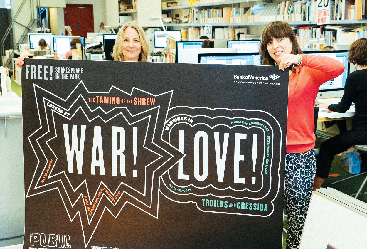
Is that why your first campaign for the Public Theater, your longest-running client, was this in-your-face concept?
Absolutely. I had initially designed three identities for them, and [then artistic director] George [Wolfe] picked the loudest one. He knew what he wanted—he knew his audience. It was shocking and jolting, and it totally worked. [The busy, street-style typography I created] quickly became a fad and soon everyone was doing it. I’d never had that happen before. It was pretty scary.
Before you ever thought of becoming a graphic designer, you tried your hand at painting, correct?
I wanted to be a painter—I went to art school to become one—but I was just terrible. I used to make these kind of fractured charts and graphs of things that were nonsensical. I didn’t know what graphic design was when I went to art school.
Over the years, you’ve managed to keep painting anyway. Your paintings have more recently become another side to your creative practice.
I’ve been showing paintings for fifteen years now. I’d done a self-portrait [in 1992]—which is in this new book [Paula Scher: Works (Unit Editions)]—and people began asking me to make similar things as illustrations.
In the nineties I did the cover design for an annual [catalogue] AIGA publishes called Graphic Design USA. On the back cover, there’s a map of the United States that I painted by hand with a listing showing the percentage of people who use Helvetica in each state. Ten years later, I was thinking about the map and those little paintings. When they’re little, they’re sort of jokes. But if they were big, I knew they’d become something else. I’ve been painting these maps ever since. Some of them are route maps; some are about natural disasters; some of them are about population. They’re really obsessive.
How does your approach change when you’re designing versus painting?
So much of design has to do with interacting with your clients. My work became a lot of presenting and explaining and trying to teach people how to see what I’m showing them. I felt like I wasn’t making anything. I felt like I’d lost any sense of creative freefall. I was losing that piece of it that’s fun—that’s largely intuitive.
When I started painting, I could spend enormous amounts of time making something and losing myself in it, without really having to have a constructed thought.
You said in an interview in the Unit Editions book, “The only things that are interesting in most design are the mistakes.”
That’s how new things are discovered. That’s why I don’t think people work together well, because they correct each other’s mistakes. They take away all the good stuff.
In this age of bots and automation, do you think the human touch will continue to matter?
Well, that’s the problem with trying to achieve perfection: You take out humanity because you take out the error. What we do at Pentagram is to make things recognizable. You know Shake Shack is Shake Shack because you see this thing that you recognize. What other people do is try to look like the norm, as opposed to creating the thing that becomes the norm. That’s a really different position to be in.
On that note: How much credit do you attribute to a brand identity when a client succeeds the way Shake Shack has?
In the instance of Shake Shake, quite a bit. But it was accidental, as these things are. I had designed the identity for Madison Square Park, which is across from Pentagram’s office.When Danny [Meyer] first talked to me, he saw [the design] like a roadside stand from his youth: neon typography and script. There was nothing wrong with that, but there was this piece of architecture confronting us—this structure designed by James Wines. He designed these horizontal metal beams as part of the architecture, and the beams provided a perfect way to do an iteration of the classic hamburger stand with “Shakes, Fries … ” across its face. I put the type between these bars, and it became part of the standard way you recognize Shake Shacks everywhere.
Fast food places didn’t look like that before 2004. They had this sort of sloppy appearance. This was a high-designed place that happened to sell hamburgers. It was a little bit tongue-in-cheek. It defined a category, “fast casual,” that didn’t have a name before that. It hit a certain zeitgeist, which was really magical.
Without all of these elements leading to that first location, Shake Shack might not be what it is today.
So often this is the truth when you go deep into stories about how things get invented: Much of it is accidental. It’s not a science. You can’t write down a list of ingredients to make something work; you have to have the right kind of hope and attitude and optimism against a particular period of time. And a little bit of luck.