Kathleen Hanna Wants You to Think About What Music Looks Like
On the eve of the Bikini Kill singer’s searing new memoir, “Rebel Girl: My Life As a Feminist Punk,” she speaks about developing a visual vocabulary that reflects her music’s inclination to deconstruct mainstream culture and build something better.
Kathleen Hanna. Photography by Jason Frank Rothenberg…
As a founding member of crucial bands like Bikini Kill, the Julie Ruin, and Le Tigre, Kathleen Hanna has spent the last few decades challenging mainstream ideas not just of who can make music, and why, but what that music might look like. Her visual syntax, expressed on record sleeves, stage design, and video art, fetishizes machinery like a feminist Kraftwerk while building bridges between DIY punk and conceptual art traditions.
Her new memoir, Rebel Girl: My Life As a Feminist Punk, is a startlingly generous account of a life spent surviving worlds of male violence both personal and professional in order to build a better world for herself and the people she loves. It’s a riot. Hanna recently took a call from Surface to talk about infinite possibilities, her favorite photocopier, and the disrespectful interiors of the standard rock club.
Kathleen Hanna. Photography by Rachel Bright…
I really want to talk to you about the visual vocabulary you’ve developed in your album covers and videos. In your early work, where was it coming from?
A lot of it was coming from work I was doing at the domestic violence shelter I worked at, which is really how I got a feminist education. I was a photographer so it made its way into my work. I was also part of a small group of six or seven women who met and talked about our work. We went to the library, waiting for High Performance magazine to come out, and Heresies, so we could Xerox articles and share them with each other.
So I was also really influenced by the obvious suspects like Jenny Holzer and Barbara Kruger and people who weren’t shying away from politics and were using text with images. My friends and I had an art gallery, and to keep the lights on we had punk shows, so I started making the flyers and then making stickers for bands. I really loved the cut and paste. It was interesting to utilize what we had at the time—and then to live through having Photoshop available with millions of images at your fingertips. I feel lucky that I’ve gotten to see this technological change in what people can do graphically.
Was there something about having to just seize whatever was on hand that was helpful to you? Or is that romanticizing a lack of resources?
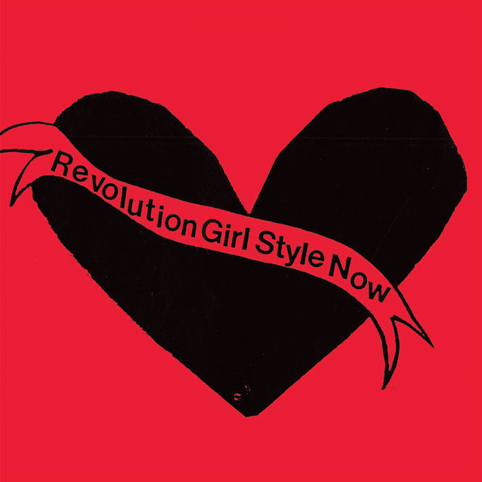
One really huge thing that happened in my life was the Mita company. Their machines made the best photocopies. If you knew someone who worked at Kinko’s, you could go in and make unlimited copies. I made like three album covers and countless fanzines there. But they got a Mita copier and it had a button where you could get red ink. I almost passed out. Bikini Kill’s Revolution Girl Style Now was before the Mita copier—that was just on red paper. But now if I had white paper, then red and black on the white paper meant I had three colors.
It was a huge deal, which is really bananas if you think about the dropper tool on Photoshop where you can drop it on a 55-year-old woman’s hair and be like I want exactly that color. Having two or three colors, and doing everything myself, but a box around what was possible. I liked that. But I also love having infinite possibilities.
“Revolution Girl Style Now” by Bikini Kill…
The Bikini Kill artwork is so instantly recognizable. Were you thinking of branding or a kind of graphic identity?
Quite the opposite. We didn’t stick with one font for the logos. All my friends had little boxes of alphabet stampers. We’d go to the stationery store or someone would go to, you know, Sweden, and bring some back, the kind used for kids’ birthday cards. One of the big Bikini Kill logos is from that.
That handcrafted feeling really came to the forefront with the Julie Ruin artwork.
I was into elevating craft and thinking about quilting as art and women’s work being relegated to craft. The big thing about the Julie Ruin record was a new invention that came to town. Across the street from the library I went to was a small copy place and they got a color copier. The cover is actually a visually ruined record. I put a black and white photocopy cut out on top of a color copy and taped onto the back of an AC/DC record, because it was all black and I needed a black background of the right size.
“Julie Ruin” by Julie Ruin…
Why was it important for you to expand into costume and set design and visual art for Le Tigre, in doing it all at the same time?
You just said it yourself. Doing it. I had the graphics thing I was always doing, related to the bands. There was the songwriting piece of it. The costume piece of it didn’t take much time—but I was thinking about the way I presented myself on stage as a part of what I wanted to talk about. I remember every shitty backdrop we had to perform in front of, every back wall painted with really shitty flames and the name of the club like a big tattoo. I was always thinking of what we would look like photographed, which is why I started writing stuff on my stomach, to draw people’s eyes away from the ugly backdrop.
I have a problem: there’s, like, wallpaper borders I’ve been in the same room with that I feel really angry and destructive toward. (laughs) With Bikini Kill, a lot of the time we had no control over what the stage looked like. One of the only ways I could change that was to put a white screen on the wall—it started with a white sheet and a slide projector.
It’s not really like I’m a control freak. It’s more like, I wanted my art to look like what I wanted my art to look like. These assholes who ran these fucking ugly ass clubs didn’t even take the time to make it look nice for the bands. It’s not hard. A red curtain always works. So it was this feeling of being disrespected. And I wanted to make something visually beautiful and undeniable. We worked really hard on that by having costumes and getting a video projector and having props. It was like being a moving painting, or an installation that people were physically a part of.
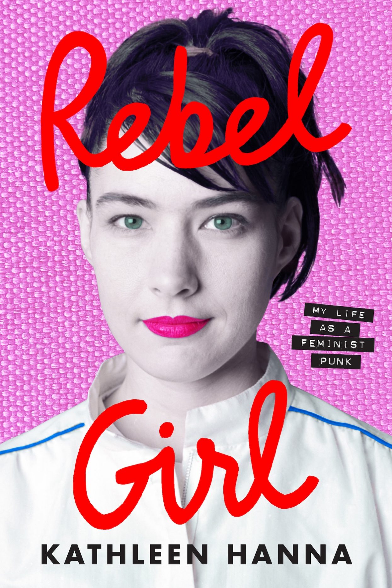
You designed your book cover, as well. Do you think people are surprised by how, sort of, friendly it looks?
Originally, I used a photograph where my mouth was open and words were spilling out of it. I think that was more people’s viewpoint of me: loud. You know what I mean? Like, the word slut on my stomach and yelling into a microphone. But the book is really sad and vulnerable, and I thought it was punk—not punk, but a kind of middle finger—to have me look really soft on the cover. I don’t have to look a certain way. There’s pictures of me where there’s eyeliner running down my face that I could have used, but I used a beautiful staged portrait that I want to look at. Because it’s my fucking book!
“Rebel Girl: My Life As a Feminist Punk.” Book cover by Ecco …