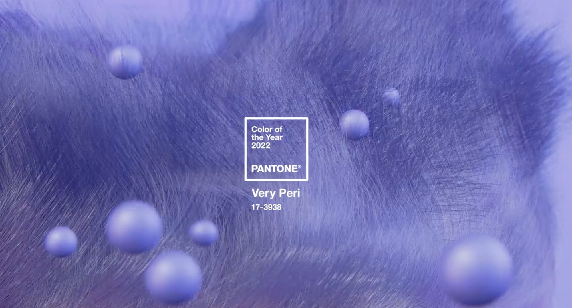
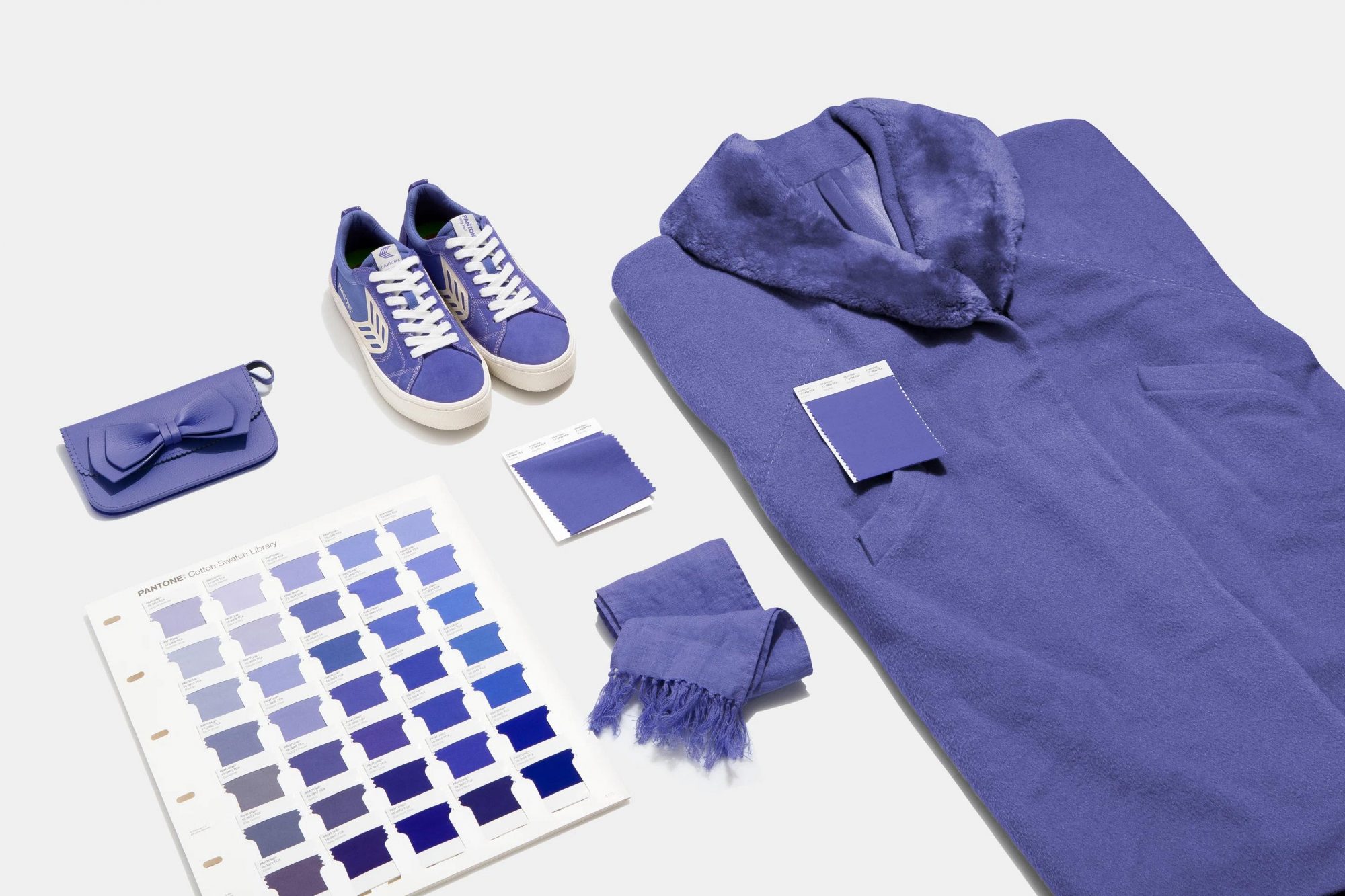
What’s Happening: Pantone has unveiled its annual Color of the Year for 2022, Very Peri, which it says symbolizes our transformative times and is billed as a “sprightly, joyous attitude and dynamic presence that encourages courageous creativity and imaginative expression.”
The Download: The manifold colors of the year announcements have become one of our guilty pleasures—the overwrought characterizations and lighthearted frivolousness can offer a moment of levity from the weighty issues of the world. (We’ve been known to have a little fun with the whole spectacle.) But has the marketing power and effectiveness of these designations waned? Pantone, a pioneer in the space whose first COTY was named in 2000, now faces stiff competition from the likes of Benjamin Moore, PPG, AkzoNobel, Sherwin-Williams, Dunn-Edwards, Behr, RoomMates Decor, Glidden, Robert Kaufman Fabrics, and even Etsy. Cream Moonstone, Cosmos, Olive Sprig—if you don’t have a COTY at this point, do you even color?
Once considered a reputable cultural forecast for the year ahead, some observers are calling out the brand for its recent lack of originality. So who is the current authority of anointing a color to represent us all? Unlike past years, when Pantone would mine its archive for hues it feels are relevant for the collective mood, Very Peri (PANTONE 17-3938) is the first-ever new color to be crowned COTY. Described as a periwinkle blue with violet-red undertones, it is intended to “embrace this altered landscape of possibilities, opening us up to a new vision as we rewrite our lives”—a message clearly crafted for the pandemic era. (The dual selections for 2021, Ultimate Gray and the sunflower-yellow Illuminating, were laden with themes of strength, hopefulness, and uplift.)
In its analysis, Curbed saddled Very Peri with the pejorative “recycled,” saying it calls to mind a “color you’d find in an L.L.Bean catalogue that’s a little more spicy than beige but just as safe.” Ouch. They go on to point out that the 2016 Colors of the Year, Rose Quartz and Serenity, were couched in language about “gender blur,” a topic on the forefront of the public consciousness at the time that has since become a flashpoint in the culture wars. The 2019 choice of Living Coral drew criticism for its tone-deafness as climate change continues to ravage reef systems around the globe, a pattern Slate labeled “awkward wokeness.”
In Their Own Words: “I don’t think there’s anyone that can beat us,” says Laurie Pressman, vice president of the Pantone Color Institute. “Did we look at what they did in their forecast? No. Did they look at us? Perhaps.”
Surface Says: Standing out in an over “saturated” market requires some out-of-the-box thinking, so we’re endorsing Curbed’s candidate: Dopamine Dressing.


