In 1999, Pantone greeted the 21st century by inaugurating its Color of the Year program, a prognostication of which tone will best characterize the next 365 days of interior, graphic, and product design. It picked Cerulean Blue 15-4020. And perhaps that was apt: if the vibe of any this century could possibly be close to “blue skies ahead,” it could only have been 2000.
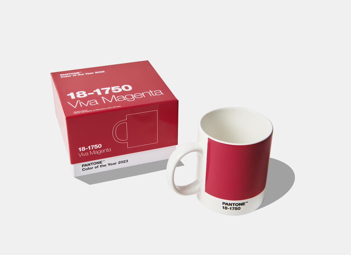
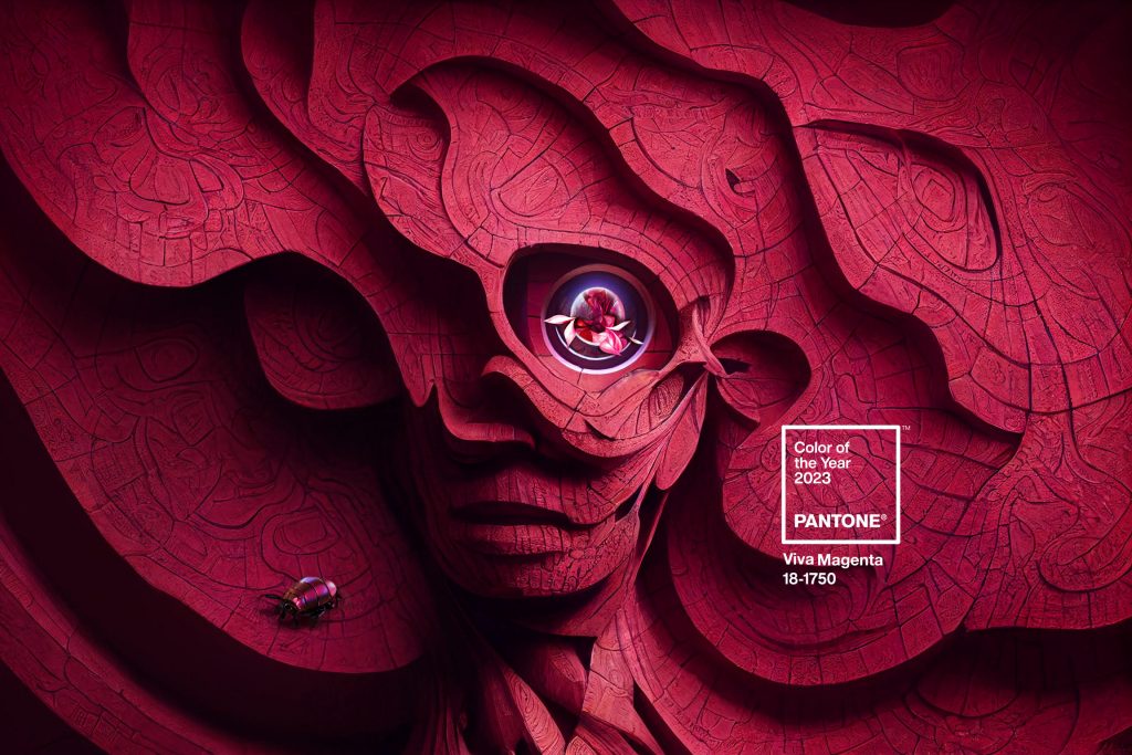
For 2023, Pantone has selected Viva Magenta 18-1750. Perhaps it will soon tint your walls, magazine covers, and furnishings; it can right this moment rope around your neck in a Pantone Long Keychain. It’s easy to shade all this merchandise, to wonder if there are hues of colonialism in one American company dictating a color-monoculture. It’s understandable to blanche at the company’s recommendation to live with the color as “an NFT projection in a white entryway.” Some might empathize with Blanche Devereaux, the Golden Girl who famously felt for the color a deep, existential hate.
On the other hand, maybe Pantone is right and magenta has some currency. There’s a retro-future vibe: the Aztecs used cochineal bugs to create its ancestral red dye, which became a major trade good and fed empires; now, scientists are trying to harvest the acid in a lab. Magenta is a building block of color printing and a prominent tone on TikTok’s UX. Pantone claims its pick nods to a growing awareness of the natural world and dimming need for gender markers—here’s hoping.
“It does not boldly dominate but instead takes a ‘fist in a velvet glove’ approach,” the press release says, and, well, fisting and velvet are as popular as ever. And magenta surely fits into the ongoing revival of late-‘90s, early-‘00s aesthetics—calling back to a time before we knew how cloudy the skies of this century might be, and a moment when Pantone was virtually alone in what’s now a crowded field of chromatic fortune-telling. (For what it’s worth, Benjamin Moore says 2023 belongs to the decidedly juicier Raspberry Blush 2008-30, while Sherwin-Williams went for the earthy, coppery neutral Redend Point.)
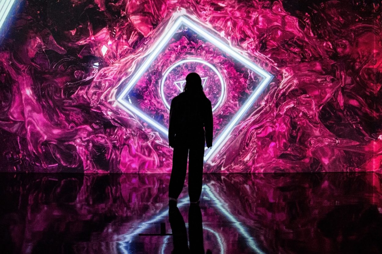
“Viva Magenta is brave and fearless, a pulsating color whose exuberance promotes a joyous and optimistic celebration, writing a new narrative,” Pantone said when announcing the color’s selection. The brand also spent $1 million hyping up the “Magentaverse” and touting corporate partnerships at Art Basel—which looks like business as usual.