Photo by Jenna Bascom for International Center of Photography.…
Over the past quarter-century, the photobook has quietly become one of photography’s most vital forms, capable of tracking a country in constant movement. On view through September 28, the International Center of Photography in New York City presents “Photobooks USA 2000–25,” an exhibition bringing together more than 50 photobooks, from out-of-print titles to recent landmark publications, that trace how photographers have used the form to respond to the social, cultural, political, economic, and environmental shifts of the 21st century.
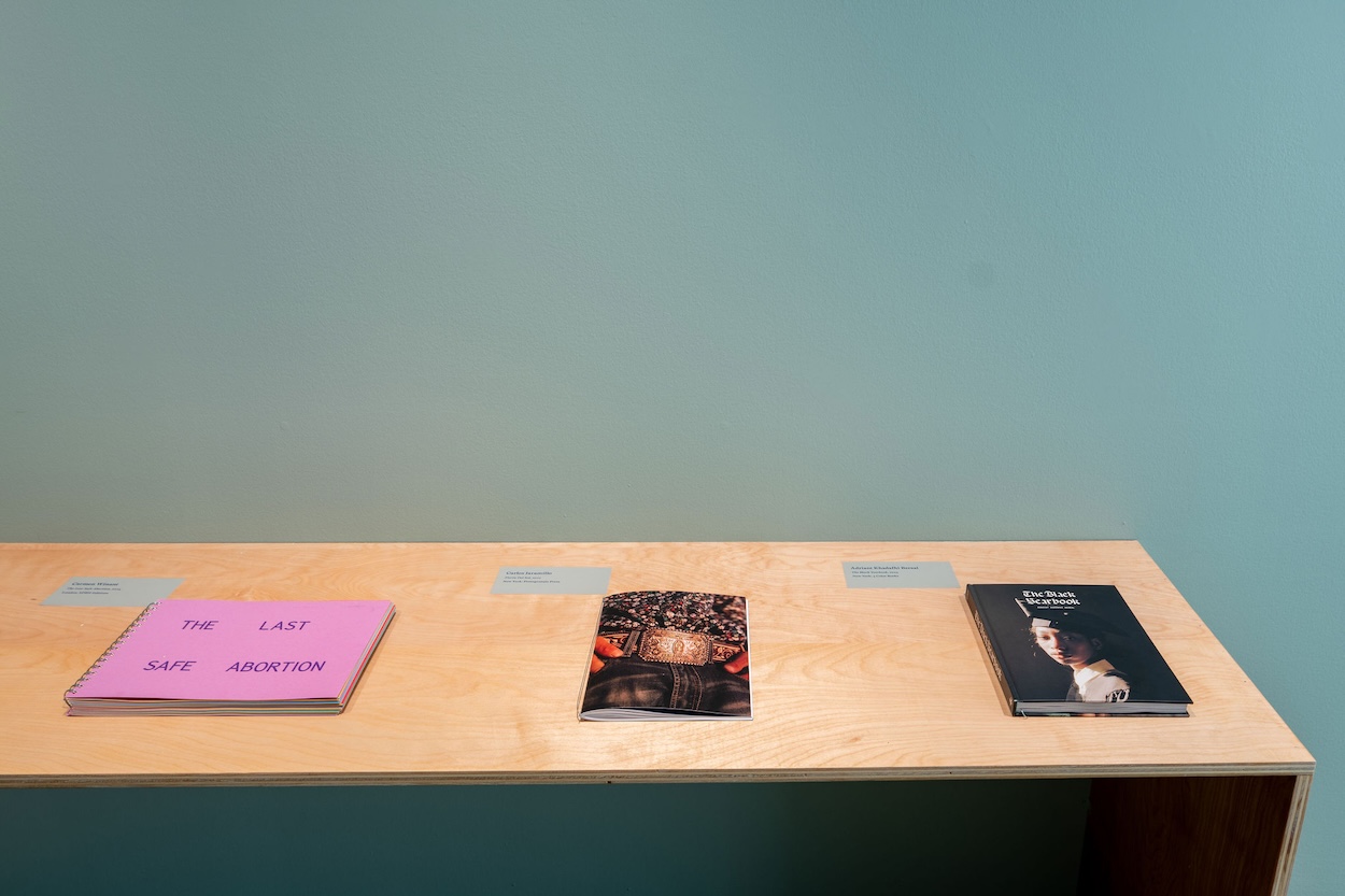
Co-curated by ICP’s David Campany, Sara Ickow, and malaika newsome, the show doesn’t glorify bestsellers. Instead, it displays an increasingly inclusive medium, one capable of showcasing everything from LaToya Ruby Frazier’s The Notion of Family to Carmen Winant’s The Last Safe Abortion.
Ickow, the Associate Director of Exhibitions at ICP, speaks with Surface about the unexpected discoveries that shaped the curatorial process, how the photobook has evolved into a site of collaboration, and the new relationships between works that emerged once the exhibition came together.
Photo by Jenna Bascom for International Center of Photography.…
“Photobooks USA 2000–25” is the first exhibition to examine the last quarter-century of photobook production in the United States. As you were assembling the exhibition, what themes or shifts began to emerge across that period?
As my two co-curators and I started shaping our checklist for the exhibition, there were things we knew we would encounter: various ways of experimenting with forms, the rise of certain publishers, increased inclusivity, etc. Then there were details we hadn’t anticipated—some of the micro-trends in design as one example. Fold outs became popular in the late 2010s, interweaving of image and text waxed and waned throughout the 25 years, the use of multiple paper stocks in one book has had a boom in the 2020s.
We also tried to make sure we included books that represented as many aspects of American life as possible. One thing we thought would be more prevalent was books about NYC, given our understandable biases as a New York institution with networks based in and making work about New York. We were also surprised to discover how many books that felt the most important from this period were composed of photographs made prior to this period: books like Baldwin Lee’s monograph from 2022 or Carla Williams’s Tender were some of the earliest choices we made for the checklist. Despite that they were recent books looking back, they felt as timely as anything else we were considering.
Some of the themes we ended up highlighting in the sequencing and division of books were place, experimentation with form, looking back, personal stories, and investigations of the United States.
Over the past 25 years, photobooks have become increasingly ambitious in their design, production, and materiality. From your perspective, what has driven that evolution?
There are so many factors that have played into this increasing ambition, but the one that feels the most apt to me is the appetite from photobook collectors and enthusiasts. As artists became more ambitious and tried to experiment more, those books sold well, were collected by libraries and museums and proved to publishers that there was interest.
The evolution in design mirrors a lot of the changes we’ve seen in exhibition design as well. Photographers have been increasingly experimenting with different styles of framing and displays like printing on vinyls, layering materials, etc. A lot of these ways of working with images are also seen in books. Full-bleed pages, textured papers, different kinds of bindings are all ways to make a book feel unique. The form becomes part of the work, it isn’t just the images that make a photobook, it’s all of the choices that come together to form the book.
As there was an increase in the number of publishers, in order to differentiate their work and carve out a niche in bookmaking, you also get more publishers who then specialize in different types of books. Book designers have unique styles and when artists, designers, and publishers “meet their match” it allows for all of the collaborators to really dream and make books where the form can take inspiration from the work itself. We have quotes on the walls in the exhibition from photographers, publishers, book designers, etc. and one of the quotes I really loved was this one from Paul Schiek who founded the publisher TBW: “The actual making of photographs is only 50 percent of it, and the other 50 percent are these small, very deliberate decisions that you make about presentation, editing, sequences, paper choices, installation—all these crucial things that, in certain cases, the photographer might not be good at. They shouldn’t necessarily be expected to be good at all those things. That’s why it’s important for publishers, editors, designers to be able to step in and round out the project.”
Photo by Jenna Bascom for International Center of Photography.…
How do you design an exhibition around an object that’s meant to be experienced in your hands rather than on a wall?
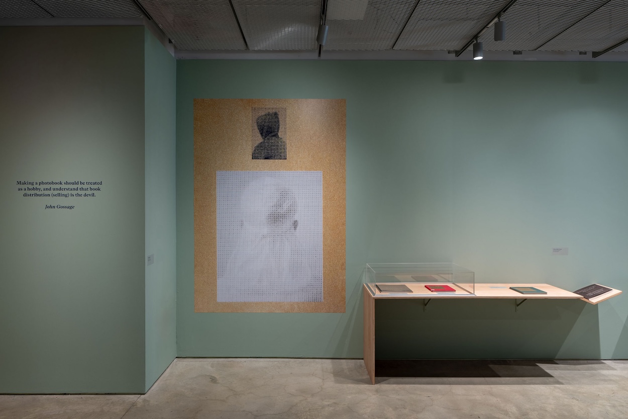
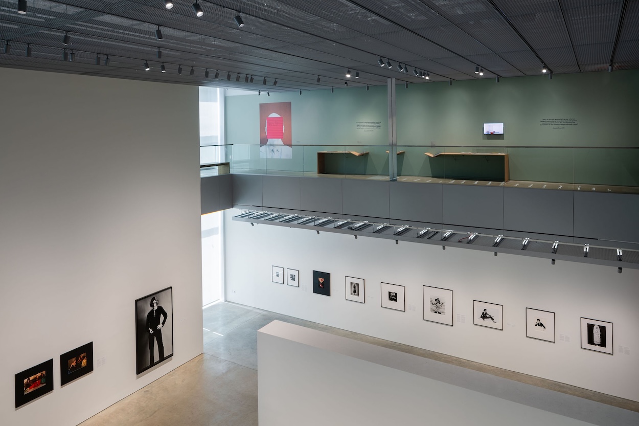
There were a few factors we needed to keep in mind, both practical and conceptual. We knew from the very beginning that we did want to make as many of the books as possible available for visitors to handle. It was never an option to present them only under glass or as videos, it was absolutely essential that it be a tactile viewing experience. How could you show people the evolution in the form if no one could handle the books? Without being able to handle them you can’t get a sense of the paper choices, the weight and feel, and of course you could only have access to a limited number of images. This meant that the design of the show needed to be focused on a series of tables/flat displays to allow for comfortable viewing that could also keep the books from being too destroyed throughout the run of the show. It also meant we needed to think about what did end up on the walls so that the space still felt alive and warm when you entered.
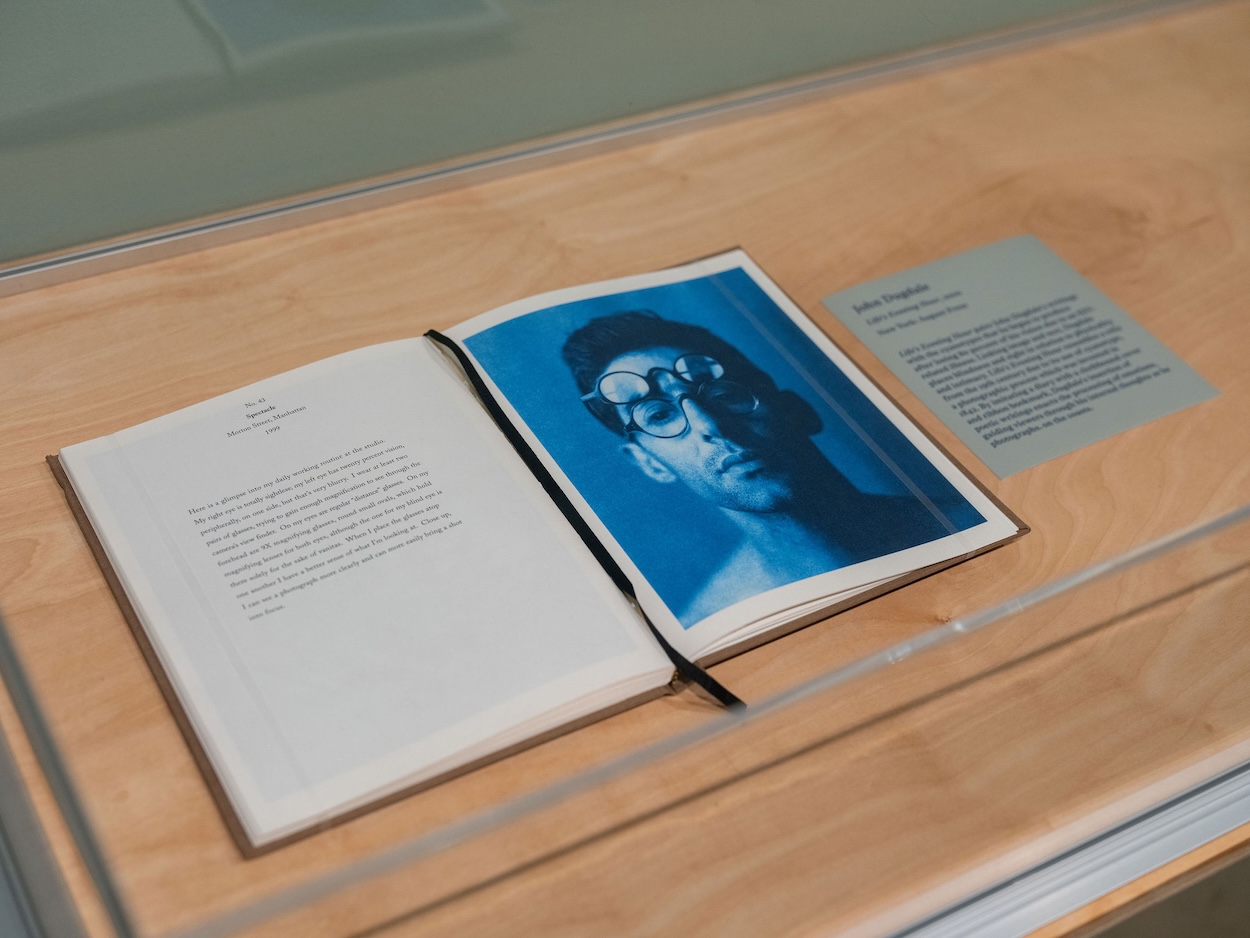
Of course for a limited number of titles we did have to put them in cases to avoid damage (either because they were costly, rare, or too delicate), and in those instances we tried to use a representative spread, film a “flip through” video, and/or add a supporting text to give more context around the book.
What were the earliest conversations with exhibition designer Chelsea Garunay that shaped the direction of the installation
Having seen installation images on Chelsea’s website we knew she would be a great fit for this project because of her experience with a lot of displays that were very architectural in nature. She’s worked on a lot of exhibitions composed of different types of objects, which is so different from many photography exhibitions where the bulk of the materials are hung on the wall in frames or other displays. Since we don’t get the chance as often to play with this kind of exhibition design we were excited to work with her and get to dream a little about what the space could look like!
We tried to set the practical parameters without dictating too much in advance. We gave her our rough budget, a floorplan of the space, the tentative checklist, and list of books that would need to be protected, and beyond that our only real instructions were to design something that could be modular. We expressed a preference for raw, finish-grade plywood to keep the space warm, but polished.
When Chelsea presented her initial design concepts, we immediately agreed on this version, which she called “tetris.” The modular tables made of segments that could be configured in different ways really appealed to us, as did the benches she built that tucked under the tables. As she developed this concept further, the floating book cradles and “broken” tables along the walls came into play as well. We loved how she took such simple materials and forms and turned them into something that feels distinct, warm, and elevated.
Photo by Jenna Bascom for International Center of Photography.…
The exhibition feels as much like a place to read as a place to look. What kinds of visitor behaviors or interactions were you hoping the design would encourage?
We wanted to encourage people to spend time with the books. Allowing for not just handling but also picking up the books felt important to make things more accessible for visitors of different heights. We didn’t want to attach them in a way that meant you couldn’t feel the weight of the book, look at the back cover, get a sense of the binding, or other elements. Our production manager found these amazing retractable cabled leashes that could slip around the book and allow for the most comfortable viewing experience for each visitor. Adding benches to some of the tables, as well as a seating area in the center of the space, was intended to encourage prolonged looking and visitor comfort.
We also intentionally avoided section texts or a strict path to take through the exhibition. We hoped people would make connections between books, might even move back and forth between different areas of the exhibitions to compare or look again at certain books. The display tables in the center of the space have extremely loose “themes,” however we didn’t make note of these themes in any of the text in the hopes that people might be able to find these connections themselves or even find different themes. We really wanted to encourage a sense of discovery.
Looking across more than 50 books, were there any unexpected conversations or connections between works that only became apparent once they were installed together?
We had a rough idea of how we would group the books on the thematic tables in the middle of the gallery before starting install, but did end up shifting some of the categories once we had the books together in the space. For example, we hadn’t realized that we had a really lovely group of books from the last few years that all engaged with ideas of place and home in some way.
We ended up moving some things from other categories and eliminating one of our planned groupings to put those few books together. We also changed some of our pre-planned sequencing when we looked at certain books together. There were pairings that ended up feeling too on the nose, or some that felt less meaningful than we had anticipated. We tried to make sure all of the groupings and sequences help guide viewers without overexplaining or being so boundaried as to prevent visitors from making their own connections.
Photo by Jenna Bascom for International Center of Photography.…