What’s it like going through this process for the second time? Does it feel much different?
It’s so much sweeter the second time. I don’t know if it’s because we’re in the throws of a pandemic, but it’s so much sweeter. You learn to take in and drink in every single moment in a much more kind of contemplative still way. It’s been really wonderful. I’ve been incredibly present and focused and trying to enjoy the process and not just the results.
When you’re making the environment for an awards show, you really have to think about where the world has been and where it is. So in this moment, it’s impossible not to be really thoughtful and methodical in your process. It’s a delicate line we are towing as humanity. I feel that kind of viscerally in my heart and my soul as we’ve gone through this process. I’m having a blast doing it.
Your design for the Oscars in 2019 was a glamorous nod to Old Hollywood. Now, post-pandemic, the theme is oriented around community and the future. Have you reflected on the difference in your mindset between the 2019 show and now as you went through the creative process? Any profound revelations?
The design in 2019 was so feminine and hopeful and aspirational. I remember really trying to make a statement about women and femininity because it was sort of in the throws of the Me Too movement. And yeah, it’s very different now. You don’t know what you’ve got till it’s gone. I think that’s part of why I’m feeling so emotional about the job—it all went away, not the job, but everything. There’re definitely little snapshots and portals into this moment in time.
What design references did you use when conceptualizing this year’s electric theme? Did any examples of architecture, art, film, or other creative fields influence your design at all?
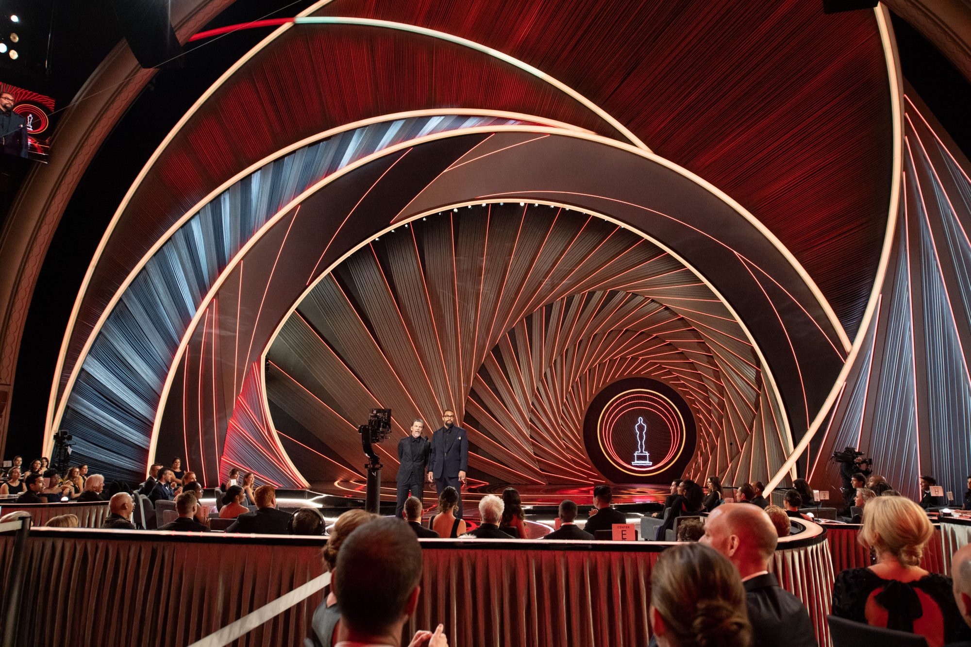
I did two main buckets of research. One was sort of old Hollywood swag, Austrian curtains, beautiful crystal chandeliers, and real old iconography. And then I did optical illusions. I tried to make a space emotionally, metaphorically, and physically that made people sit up and take note of the thing they were looking at.
From the great MC Esher all the way through to the strange gifs and memes on the internet, I’m inspired by the things that have enforced and implied depth and make you think. Like they have a built-in thought trigger. I tried to take this old Hollywood glamor and try and think about how I could take new materials and apply them in a new innovative way. There are pieces of scenery on stage that are inspired by Austrian curtains, but they’re made of metal, they’re all chain.
I wanted to make something with depth and perspective and lighting built into it that felt challenging, but also welcoming. I combined those two big premises to make it an ethereal and very dynamic space.
How’d you come up with the three environments concept?
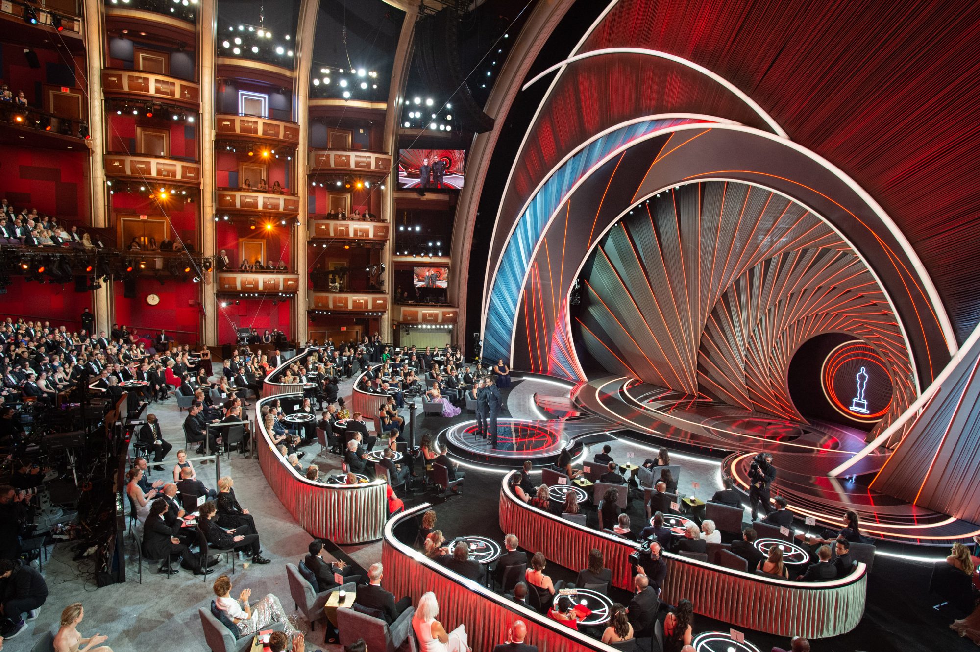
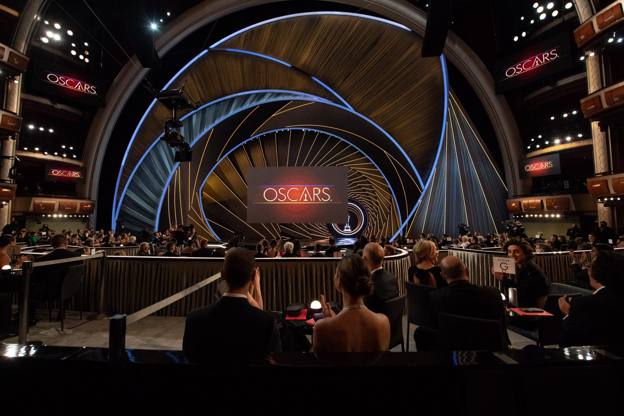
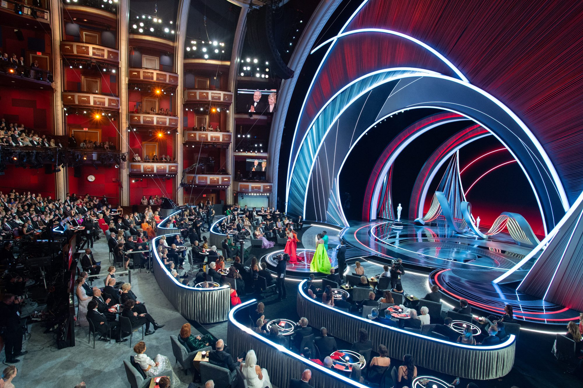
Awards shows are challenging for people to watch in their three hour times slots. But we’d sit down and watch three hours of our favorite show no problem, without even blinking an eye. So we made three different environments for three different hours and three different hosts. Every hour had its own iconography, design sensibility, sculpture perspective, line texture, and color. If you tuned in to number one, you saw this warm, voluptuous world based on curves and undulating pieces. Hour two was cool and crystal. The third hour is based loosely on triangles. It’s bold.
Awards shows are challenging for people to watch in their three hour times slots. But we’d sit down and watch three hours of our favorite show no problem, without even blinking an eye. So we made three different environments for three different hours and three different hosts.
Every hour had its own iconography, design sensibility, sculpture perspective, line texture, and color. If you tuned in to number one, you saw this warm, voluptuous world based on curves and undulating pieces. Hour two was cool and crystal. The third hour is based loosely on triangles. It’s bold. This set doesn’t look like any other awards show or really any other thing I’ve ever seen on TV. It’s bold, it’s powerful. It’s feminine and stark, masculine and architectural, and ethereal all at the same time.
What are some other elements that make this show so original?
There’s a lot of negative space in the imagery. We live or die on these lines and it’s a really strong example in restraint. Because the stage is pushed out into the audience, the result is one that is incredibly deep and dynamic. The presenters, performers, and the winners are going to be in stark contrast to this world.
Would you have attempted this design if it was your first time doing the Oscars?
Oh, interesting. I thought what I did in 2019 was bold in a different way. I’d never seen real roses on stage before, or seen the show that sculptural. So I thought I was breaking the mold. This year, the design is bold in a time period where we’re inviting all of these people back to the Dolby Theatre. To stick the stage in the middle of the room is just crazy. To deck over 70% of the of the orchestra seating and throw a stage in the middle of it and wrap people around. Every seat at the Dolby is so precious. To do something like that completely changes the molecular structure of the entire event.
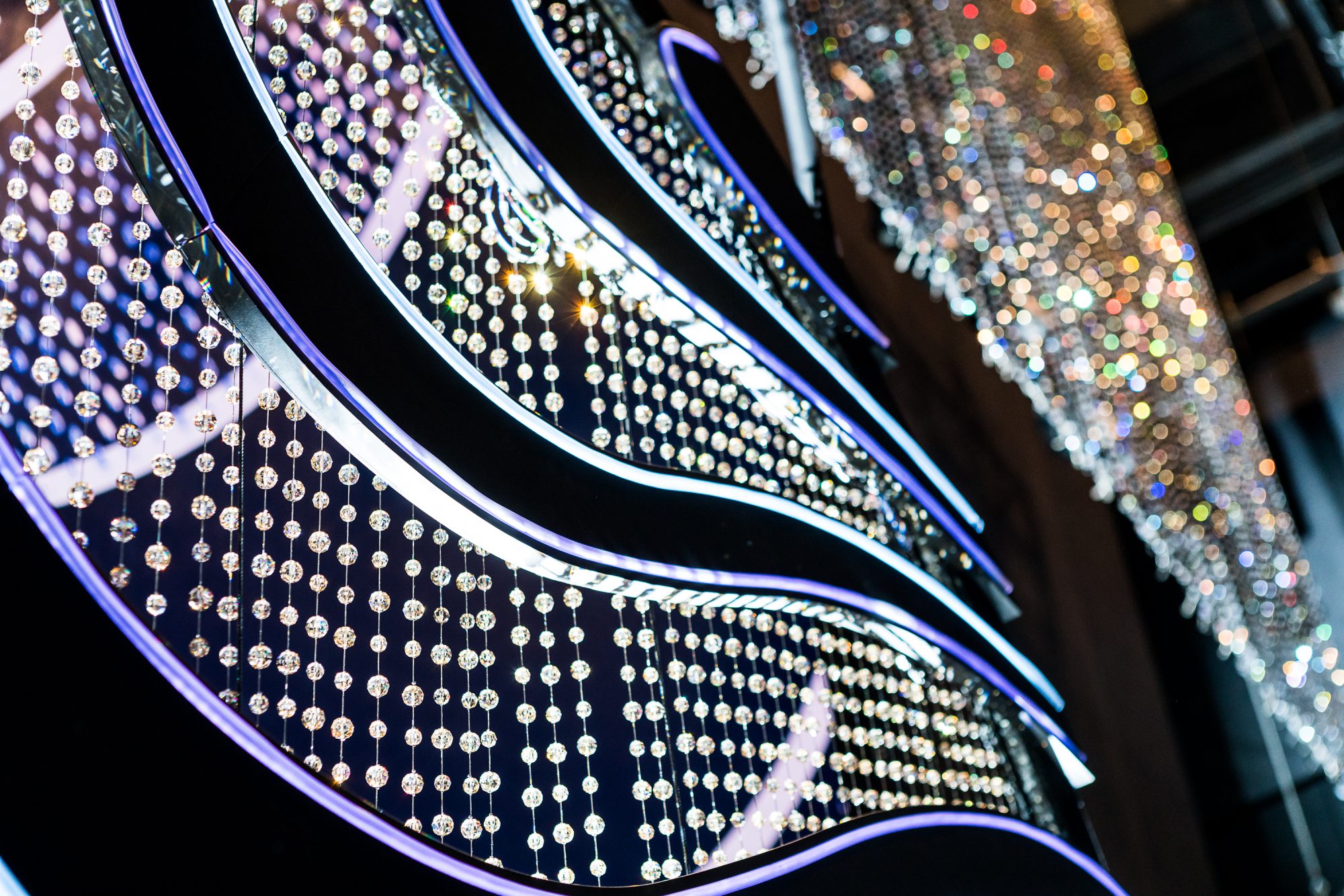
Swarovski is a staple at the Oscars and this year it will have 90,000 crystals in the show. What’s design concept behind the crystal curtain?
It’s one of those big gestures— a massively huge curtain. It comes in and makes the back wall, the set looks wet with its movement and its power. We’ve got these two spheres in what we call a dome. They are inspired with implied movement in flat pieces and depth. They’re hanging from a single point at the top, so they’re all just kind of like moving in the air, and like everything on our set, they’re hanging there and they have the ability move around the stage. They also have hundreds and hundreds and hundreds of feet of LED technology so they change color, they evolve over time, and they have the ability to create a dynamic movement. It’s pretty cool.
You said you really wanted to drive home a message of community. How did you reinforce that in your design?
The tagline of the show is movie lovers unite. We’re leading from top down in that direction, but putting the stage in the middle of the audience forced us to create all new camera angles on the winners and presenters. So if you’re are standing on that stage, you’re wrapped by people sitting in the front several rows of audience. The community part is just literally about the architecture and the space and floor plan.
The other theme of the production is future. I imagine that relates to the pandemic? I work in live events. The last two and a half years have been horrible. I live in New York City, which of course was the epicenter for a lot the pandemic. There’s an undeniable reverberation of this pandemic that will go on forever. I have two kids in school; my younger kid started the pandemic not having a phone or a computer or an email address, and then became digitally connected. There was a lot that was lost. But there was a tremendous amount that was gained. I wouldn’t have spent as much time with my kids. I did. It had not, we’d not had the pandemic and, you know, so I’ve been collecting all of these silver linings and I feel like you could choose to tell either version of that story.
So when I say it’s a portal into the future, we have an opportunity. With a war waging, and all this other stuff going on, it’s easy to say the future looks bleak, but that’s not the choice that I’m making with this design. The choice I’m making is one where the future has an inner glow. I feel like we have to walk boldly towards the light. The design and its starkness kind of reflects that it’s not easy. It’s challenging, but ultimately I think very satisfying.